BLINK- Rethinking Digital Reading
Project Type: Diploma thesis at AHO Oslo, Spring 2024
Team: Siddharth Kothiyal
Scope: Interaction Design
01/ Opportunity space
Core assumptions
Digital reading is more than moving text to screens — it reshapes how people think, focus, and remember. Yet, most reading interfaces still emulate the printed medium, ignoring the spatial and cognitive patterns unique to digital media. This assumption guided me to question: what if reading interfaces were designed around how the brain actually processes text?
Project goals
The goal was to explore how digital reading experiences can better align with human cognition — improving comprehension, navigation, and engagement. Through research, prototyping, and user reflection, I aimed to uncover design opportunities that make reading textual information feel more intuitive and responsive — not by adding features, but by rethinking interaction patterns themselves.
Define problem
Current reading tools optimise for efficiency but not understanding. The dominance of print-based metaphors like pages and scrolls limits how users form spatial memory and meaning. My challenge was to identify where these conventions break down — and design alternative experiences that adapt to reader attention, context, and cognitive flow.
Research methods
I explored the richness of the problem through a broad spectrum of primary, topical and secondary research, and expert interviews. I conducted workshops, design sprints, and data reviews to address specific obstacles in digital reading. I opted for expert interviews early and avoided narrowing it down to specific user groups because experts can recognise complex user patterns and provide nuanced reflections.
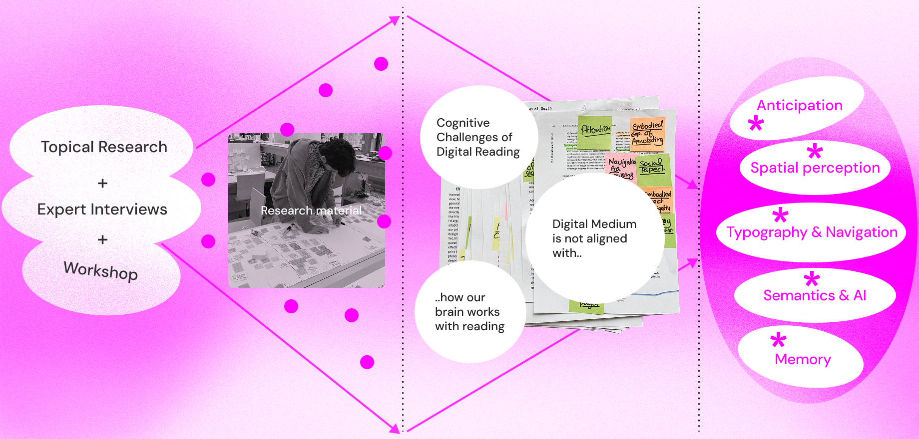
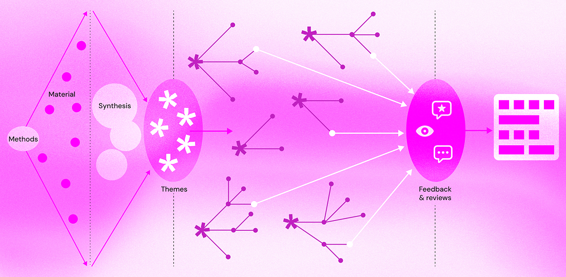
Synthesis & Emerging themes
My synthesis concluded on the cognitive challenges of digital reading — how current digital interfaces often fail to align with the way our brain processes information. This revealed how much of digital reading still borrows from print-based metaphors like “pages” and static text formatting, which limit interaction and comprehension. Cognitive studies and interviews pointed to deeper patterns — how memory works through associations, how typography guides eye movement and comprehension, and how spatial perception helps readers orient themselves within information. I clustered this synthesis into the following set of interconnected emerging themes, hypotheses and opportunity areas that shaped the next step of explorations.
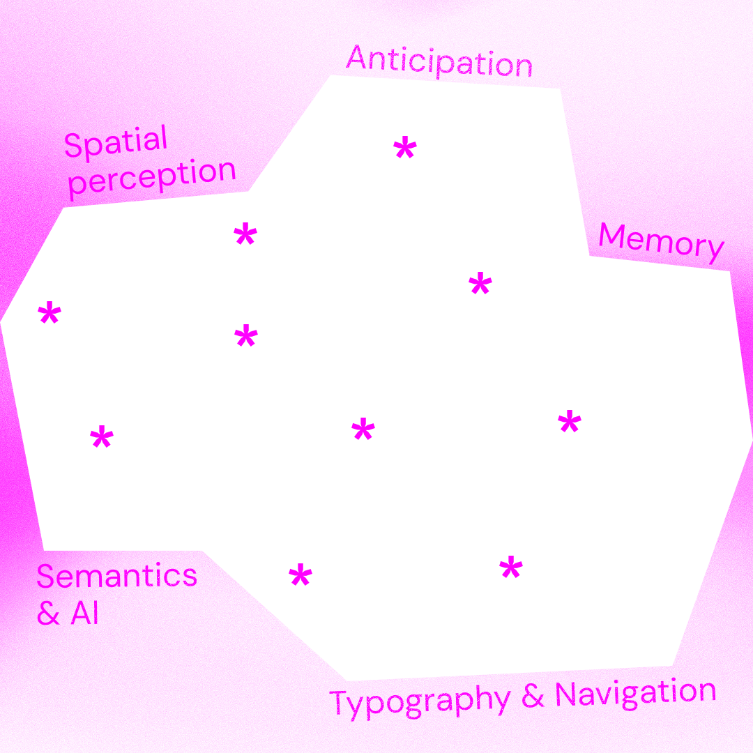
- Typography & Navigation – the structure and rhythm of text affect readability, focus, and cognitive flow.
- Semantics & AI – meaning operates at multiple scales, from specific to abstract, much like zooming on a map; AI could help manage this semantic depth for better understanding.
- Memory – strengthened by associative cues, structure, and meaningful context rather than repetition.
- Spatial Perception – users form mental maps of content using boundaries and landmarks, influencing comprehension and navigation.
- Anticipation – built upon spatial understanding, it guides users’ expectations and sense of progression in digital reading.
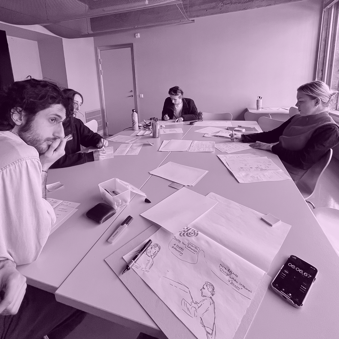
02/ Sketching and prototyping
Design direction
Building on the insights from research and synthesis, I began exploring how the emerging themes could translate into design concepts. Each theme—spatial perception, anticipation, memory, semantics & AI, and typography & navigation—became an entry point for sketching and prototyping ideas that examined different aspects of digital reading. I started by breaking these themes into focused directions:
- Metaphors to Define Summaries – exploring visual and spatial metaphors that could represent the act of summarising and compressing meaning.
- Experience of Summary – experimenting with how summaries might feel in an interface, balancing detail and abstraction to support comprehension.
- Designing Interfaces – testing interface structures that make semantic and spatial relationships visible, inspired by cognitive and typographic principles.
- Post-Summary Potential – investigating how AI could extend summaries beyond compression, towards adaptive comprehension and contextual linking.
- Contexts & Scenarios – imagining real-world reading environments where these interactions could integrate naturally.
Prototyping
Through sketches, lightweight prototypes, and quick simulations, I tested how meaning could expand or condense dynamically—similar to how our attention shifts during reading. These explorations built upon ideas from semantics and embeddings, using LLMs as a creative and conceptual material, and typography as a cognitive structure to guide reading. The outcome of this phase was a clearer understanding of how summarising can become a spatial, interactive, and meaning-driven function within digital reading, rather than a static reduction of content.
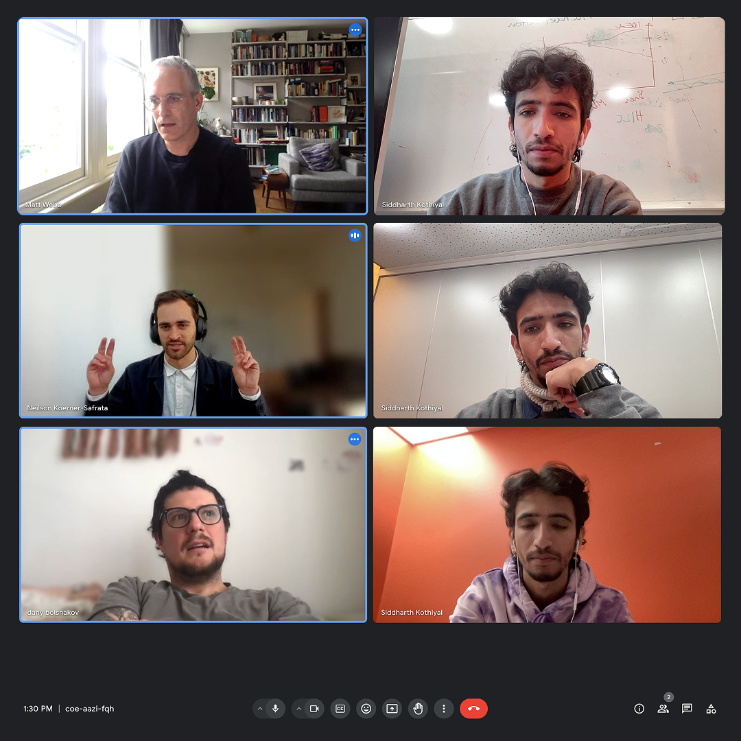
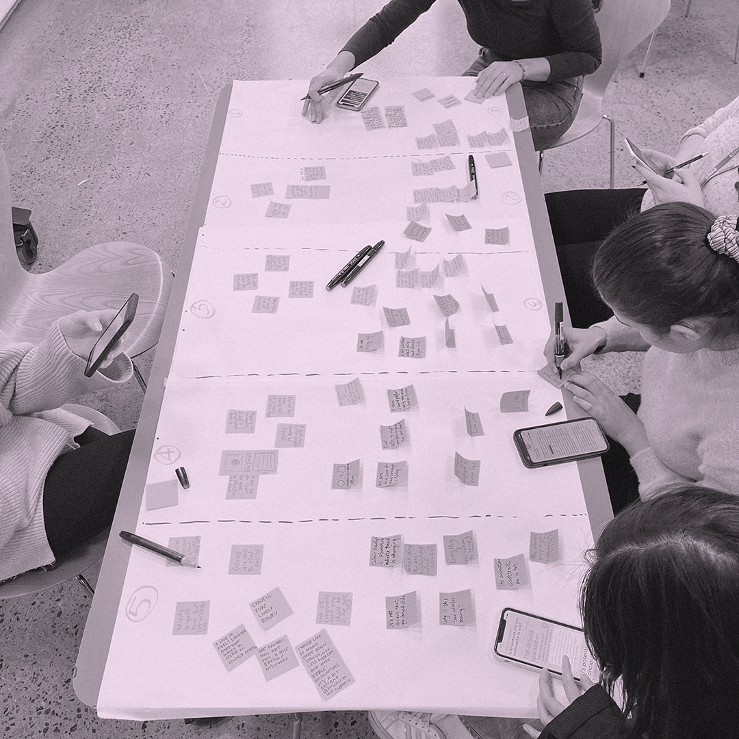
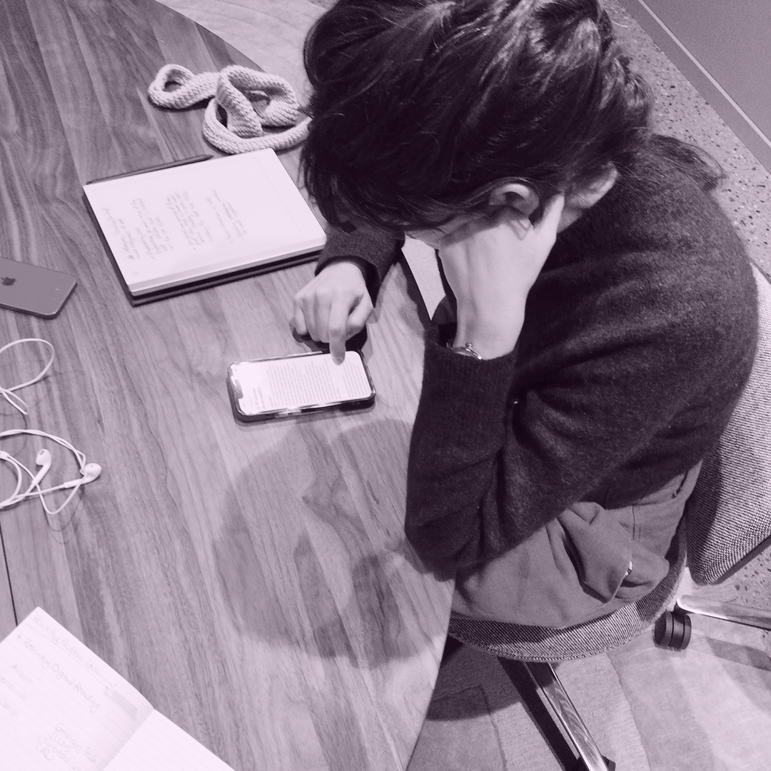
User testing, expert interviews and feedback
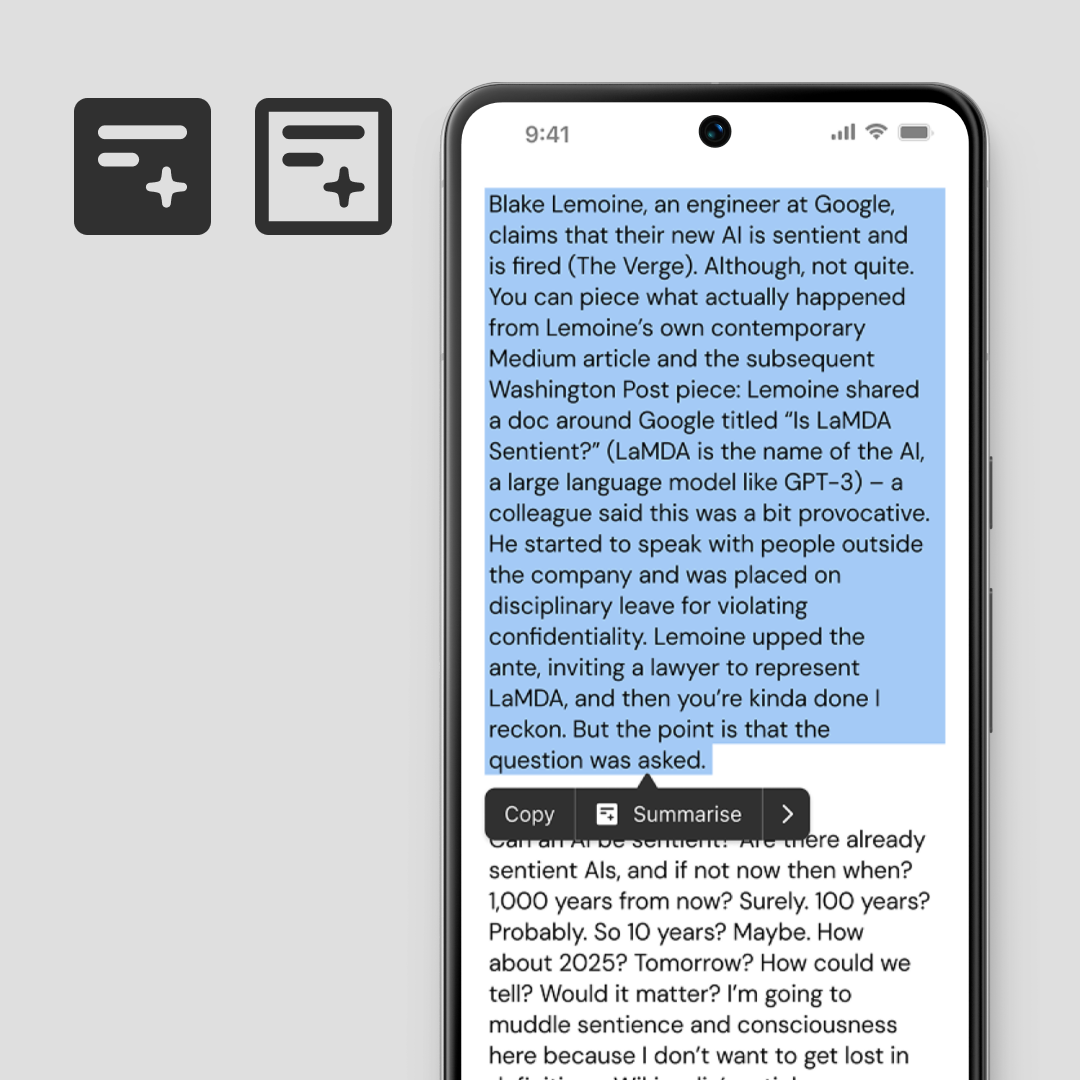
Testing prototypes: To evaluate the prototypes, I conducted a user testing session with five participants, each engaging with five different reading prototypes built in Figma. The prototypes were based on Matt Webb’s article “Is AI sentient and is it even useful to ask?” and explored various approaches to summarising, unfolding, and navigating text. Participants were selected based on their interest in topics around AI and sentience, ensuring relevance and engagement. After testing, each participant reflected on their reading experience—how easily they comprehended the text, what supported or disrupted their focus, and how they perceived the act of summarising through interaction.
Synthesising feedback: The feedback was gathered through individual interviews and collaborative discussions, later synthesised using post-it mapping to identify recurring patterns such as anticipation, feedback loops, clarity, and navigation affordances. These helped surface the cognitive and emotional responses readers had to different design treatments.
Expert insights: Following user testing, I conducted expert reviews—both in person and online—to gain external perspectives. Experts such as Caterina Forno Ríos, Theo Zamudio-Tveterås, and Jack Schulze provided detailed reflections on the conceptual direction, typographic balance, and interaction semantics. Additional feedback came digitally through shared prototype videos on LinkedIn and X, with designers and researchers commenting on aspects like visual hierarchy, zoom behaviour, and semantic flow.
This collective feedback process not only validated key interaction ideas but also highlighted areas to refine—particularly in balancing interface clarity and typographic expression. These insights informed the next phase of refinement, guiding how the prototypes evolved into coherent design directions.
03/ Conclusions
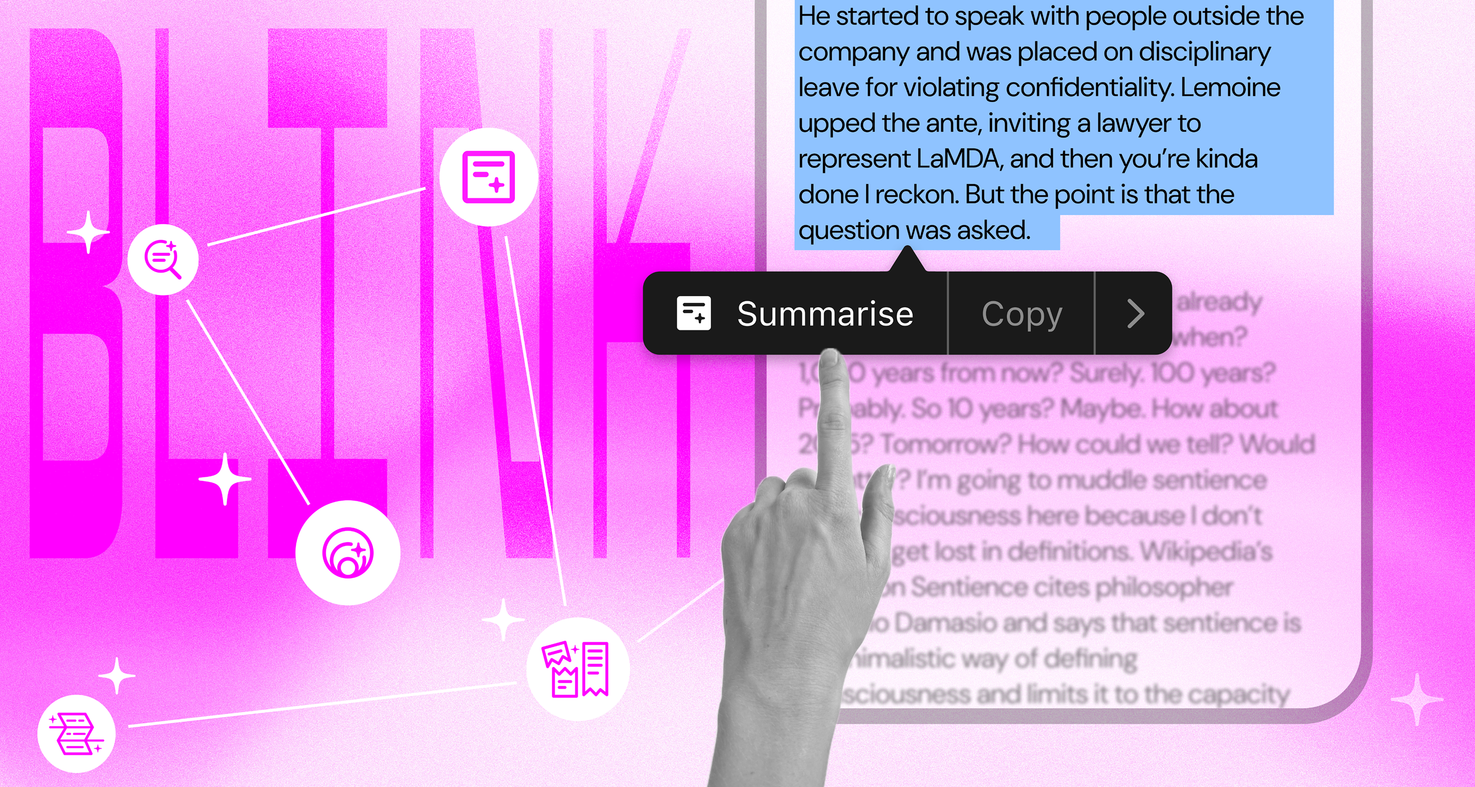
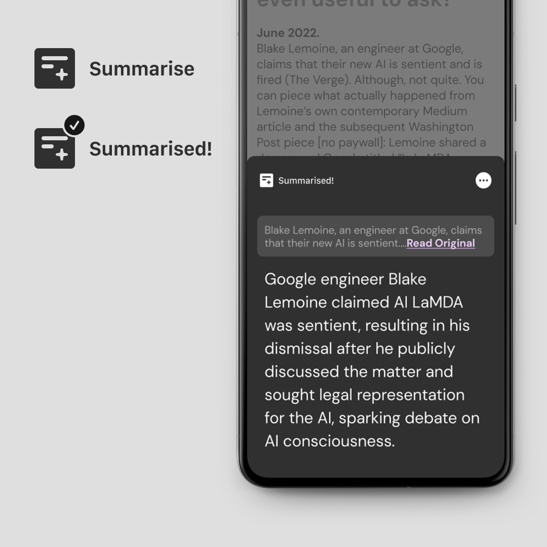
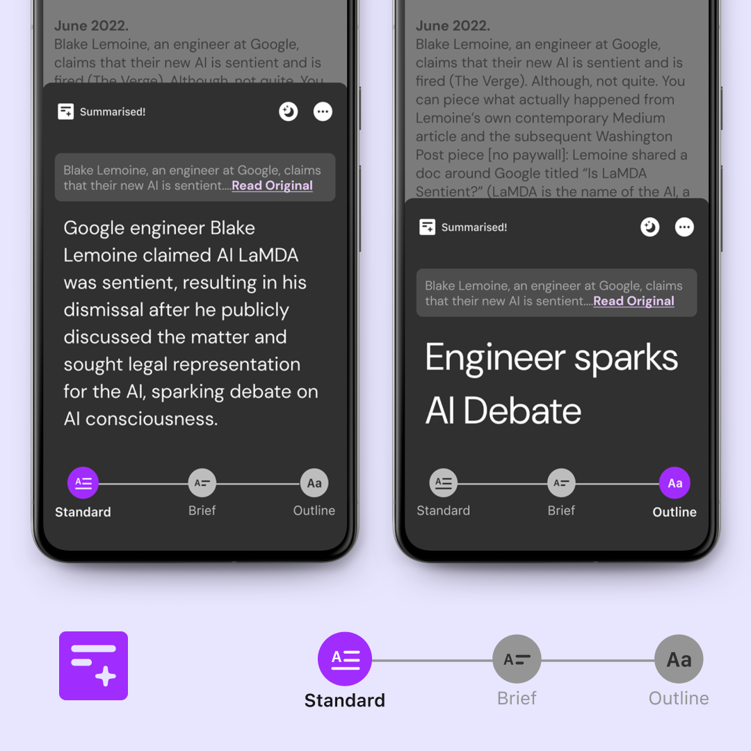
To counter earlier confusion, summary cards were redesigned to sit atop the original text, visually implying connection rather than separation. Each card explicitly displayed its status (“Summarised!”) and included a “Read Original” button to reinforce transparency and reversibility.
Feedback synthesis and refining
Following user and expert feedback, the prototypes were refined to address clarity, consistency, and cognitive flow. The goal was to make the act of summarising intuitive and transparent while maintaining its conceptual richness. The refinement began with simplifying the entry interaction—adopting a “Summarise” icon integrated into familiar text-selection actions, ensuring readers could naturally access the feature without cognitive friction.
Colour played a key communicative role. Shades of pink and purple were chosen to signify the AI-generated, “ephemeral” quality of summaries—borrowing from existing digital metaphors where blue indicates selection and red signals errors.
Finally, the summary level control was rethought. Instead of numerical or abstract metaphors like “semantic zoom,” the interface now used three labelled tiers—Standard, Brief, and Outline—each paired with a distinct icon. This created a clearer mental model of progression from detail to abstraction without overloading users with technical associations.
Together, these refinements aligned the design around readability, transparency, and user intuition, setting a strong foundation for exploring how these summaries behave across different contexts in the next phase.
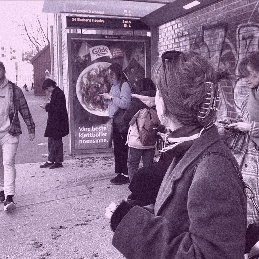
Reader in Scenarios
To ground the concept in everyday use, I placed the design within the reading habits of a fictional reader, Nora, exploring how summarising unfolds across different contexts.
While waiting for the bus, Nora uses the summarise function to condense a long section she doesn’t have time for.On the bus, motion sickness limits her ability to read, but a summary widget on her lock screen lets her stay engaged at a glance.Later, at a café, the same summary prompts her curiosity—she reopens the article and reads the full section, reconnecting with the original text.
These mini-scenarios highlight how summarising adapts to shifting attention, time, and environment—supporting fluid, context-aware reading rather than replacing deeper engagement.
Final Reflections
As summarisation becomes more embedded in digital reading, the balance between automation and comprehension becomes critical. While AI can ease information overload, it also assumes a growing role in curating what readers know — a responsibility that must be handled with care.
Summaries should support, not replace, the act of reading. Designing for this balance means enabling efficiency without eroding core cognitive abilities like recall, association, and contextual understanding.
The design challenge lies in crafting interactions that keep readers aware of the abstraction process — prompting them to engage deeper rather than depend solely on condensed versions. Thoughtful UX can help preserve the integrity of reading while still embracing the fluidity that AI introduces.