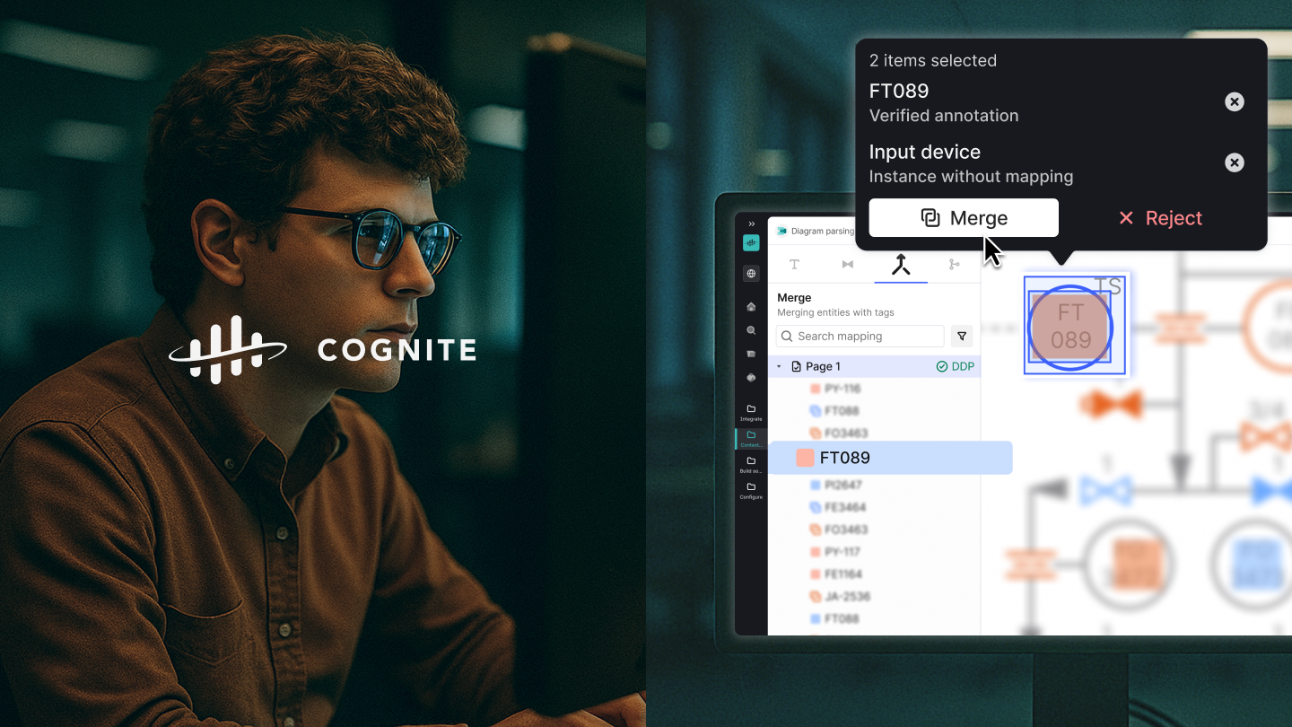
Cognite- Designing to scale up for B2B SaaS
Project Type: In-house design work at Cognite AS
Design System Team: Siddharth Kothiyal, Liz Brenner, Olga Osinceva, Cüneyt Emre, JiMin Ha
SaaS product area team: Siddharth Kothiyal, Kristoffer Husøy, Que Tran, Maksym Kowalski, Sigurd Bentzon-Hylin, Bianca Voinea, Edel Hvesser-Andersen
Scope: Product Design, Design System
Design system
Cognite’s design system is called Cogs, and that powers all the design work conducted within different area teams for the SaaS platform called Cognite Data Fusion.
Restructuring and optimising
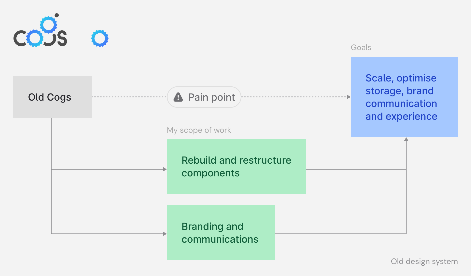
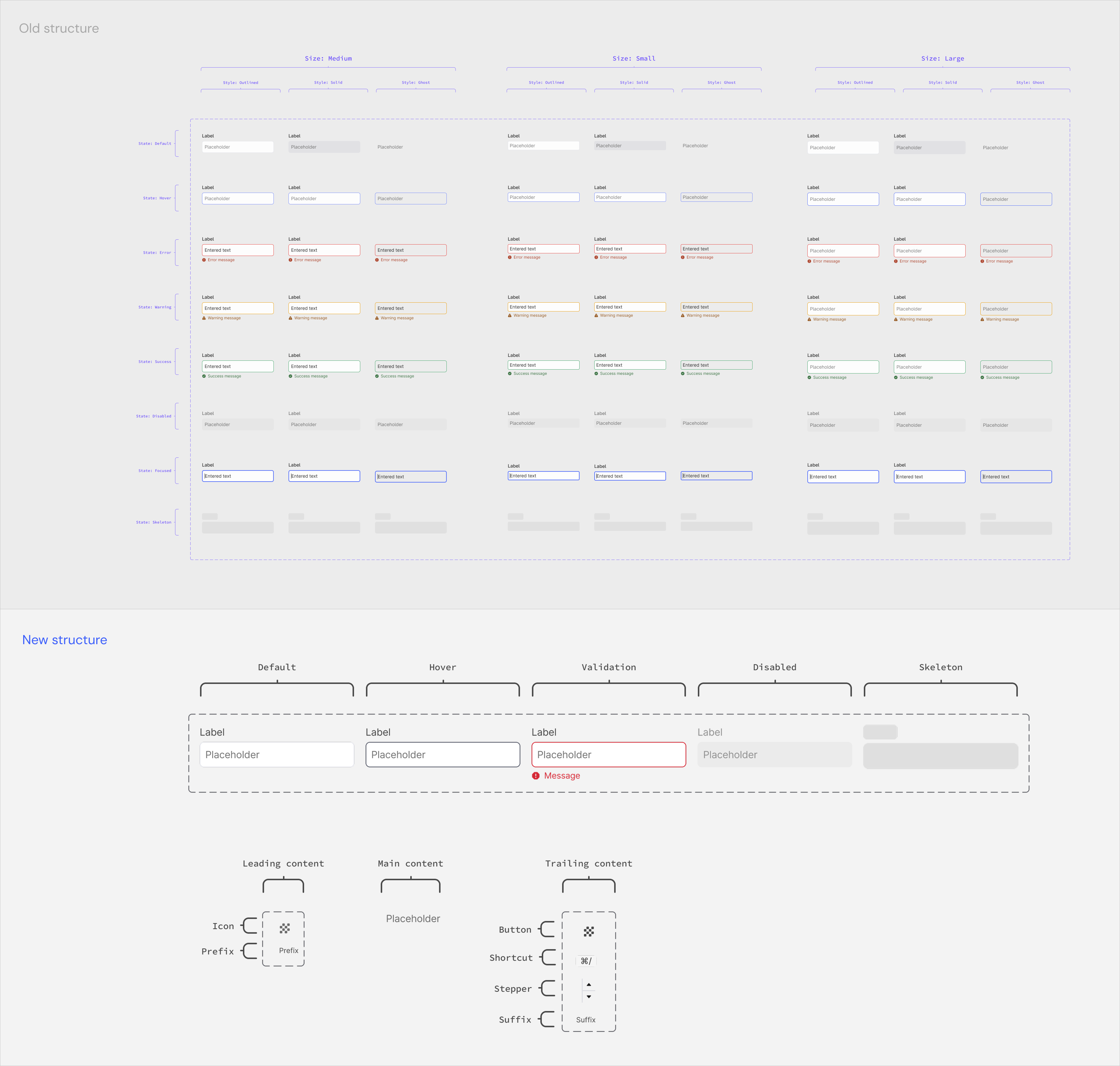
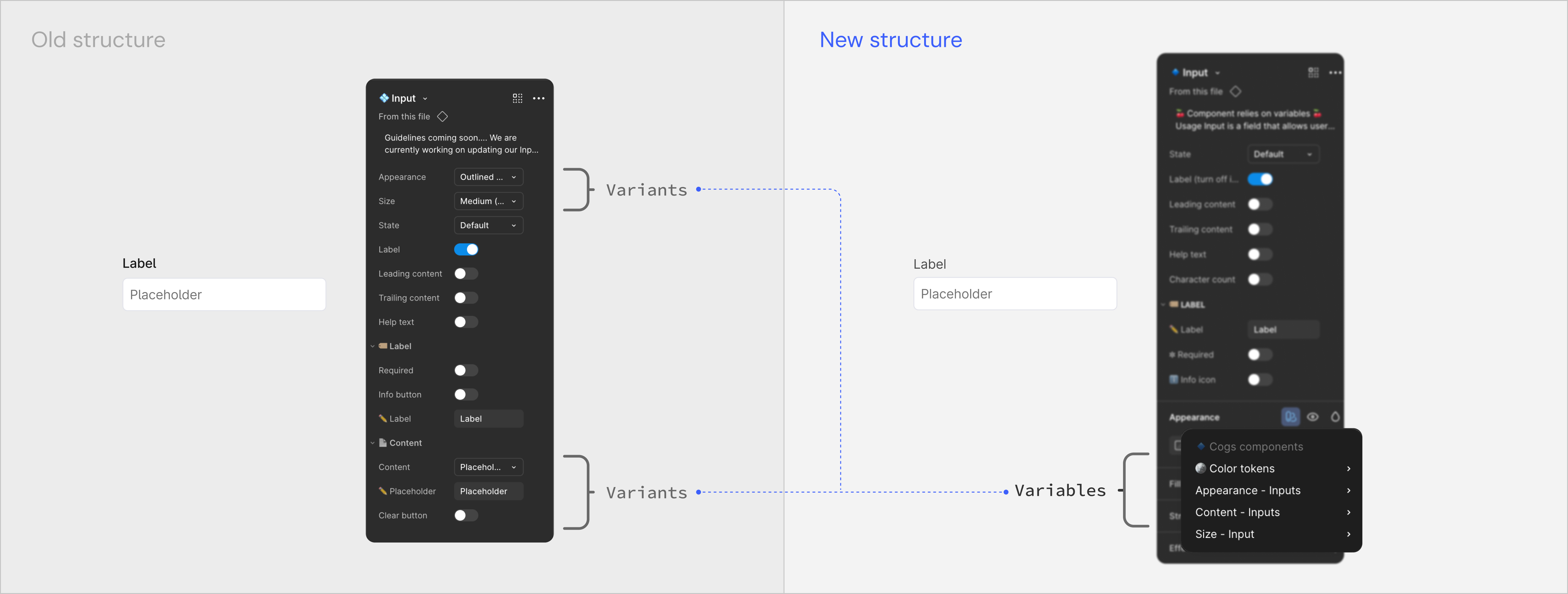
As a warm-up task, I was assigned to look at the existing design components and rebuild them on Figma. The goal was to scale up, optimise storage, and improve the experience of using and navigating the design system for other designers. The Design system had inherited the Input component, which relied on creating variants for appearance, size, state and content style. This led to a large number of variants being created and stored in the design library file. Designers faced a palette of properties to configure a simple component like the Input.
I worked with the team to simplify this experience by optimising some rarely used properties to variables and reusable nested components. I also performed component maintenance checks on a daily basis based on feedback from other designers.
Branding & communication
The design system was internally used and aspired to become more public-facing. The old identity was built to serve internally with functional communication that relied heavily on colours and emojis. I worked on making the communication effective and consistent through a unique and flexible visual identity. I interviewed the design system team and also other Cogniters who dealt with Cogs about how it was currently perceived and how it wanted to be perceived. I delivered across different communication touchpoints for Cogs within the Figma files and other platforms like Zeroheight, Storybook.
The fundamental idea for the visual design direction was to come across as a design system that is not rigid and allows flexibility. I translated that core idea into the design execution through a balance of rigid-looking shapes offset within a grid, and they get merged together with soft, rounded edges. This led to designing custom letters for the COGS logo, brand language and was also followed up throughout the colour application.
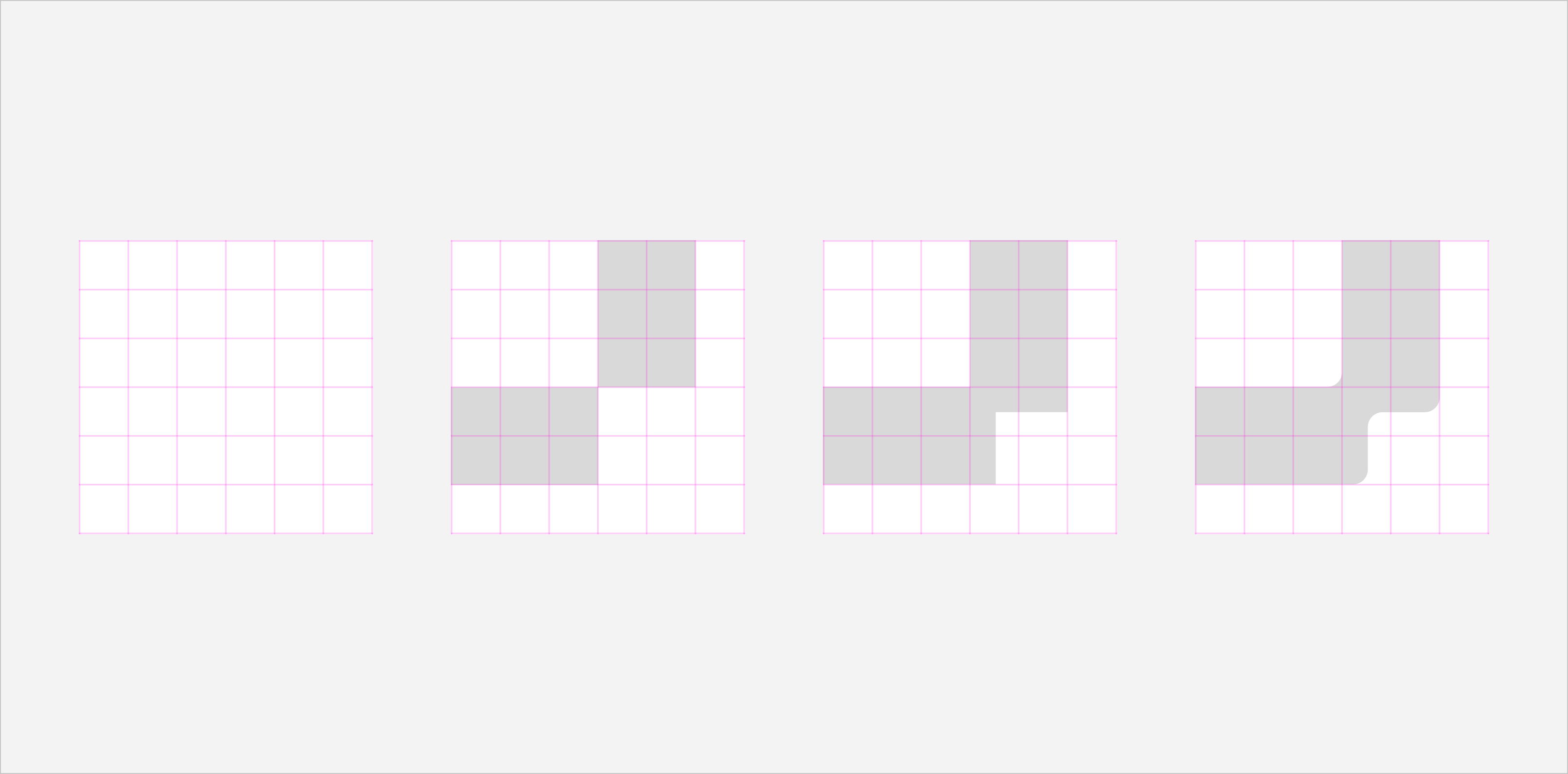
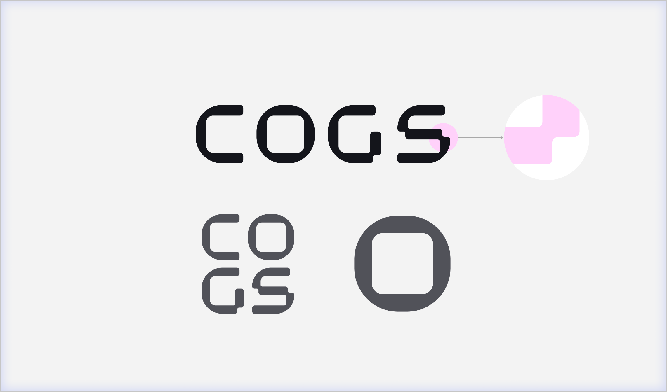
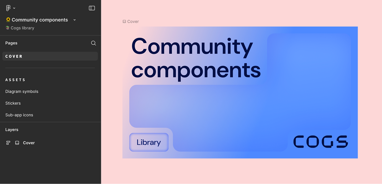
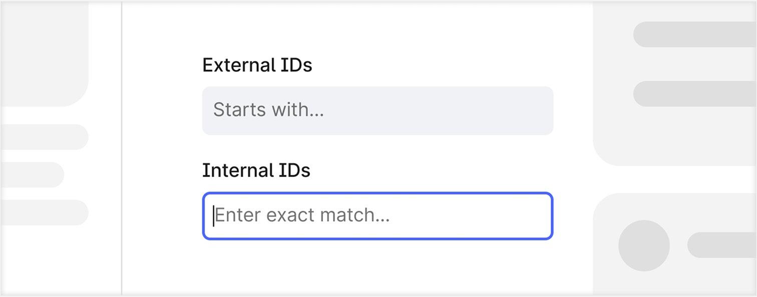
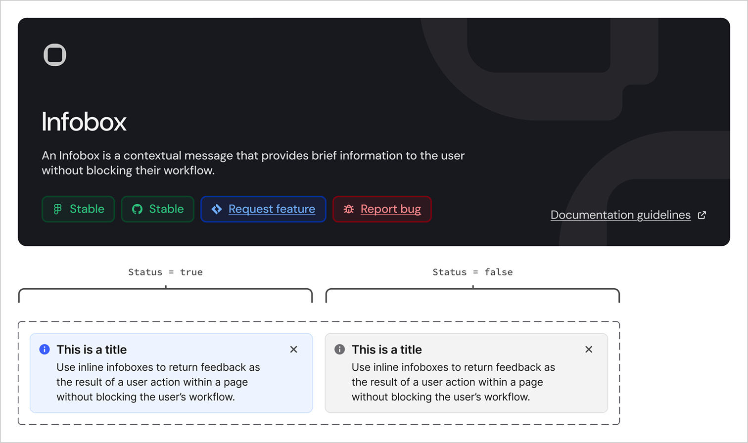
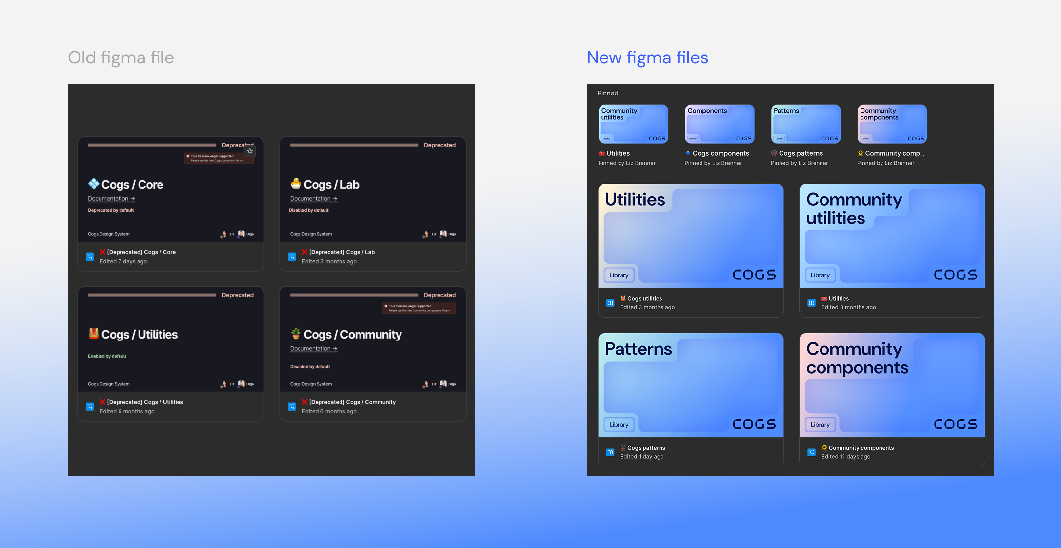
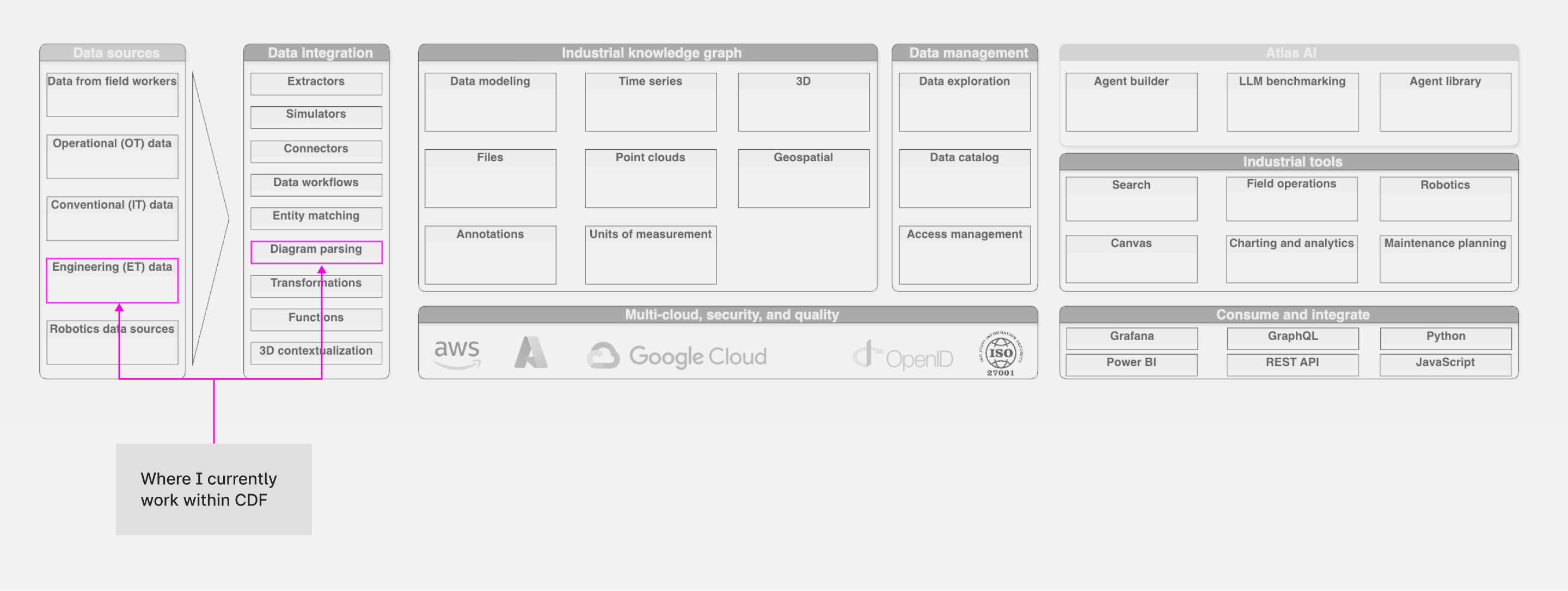
Diagram Parsing in CDF
After working with the Design system’s team for 4 months, I was migrated to a product area called Contextualisation within Cognite. The Challenge was introducing Cognite’s newly updated Diagram Parsing application, which extracts assets like valves, pumps from static P&IDs and connects them to facilitate the process of “Contextualization” for data modelling. The application was providing this in a new way within the new application, which needed to be understood by the user. The output wasn't perfect, and it required a lot of human verification. The bigger goal was to allow scaling this process, as thousands of diagrams needed to be processed and the high cognitive load was slowing down the verification process.
As a Product Designer, I worked in a team with a PM, Tech lead, and Backend architect, Front-end engineers and was supported by a Senior Designer. My focus was the "Review Experience." P&IDs are visually dense and cluttered. How might we reduce cognitive load so users can understand and scale up to processing multiple diagrams?
Defining Success: OKRs
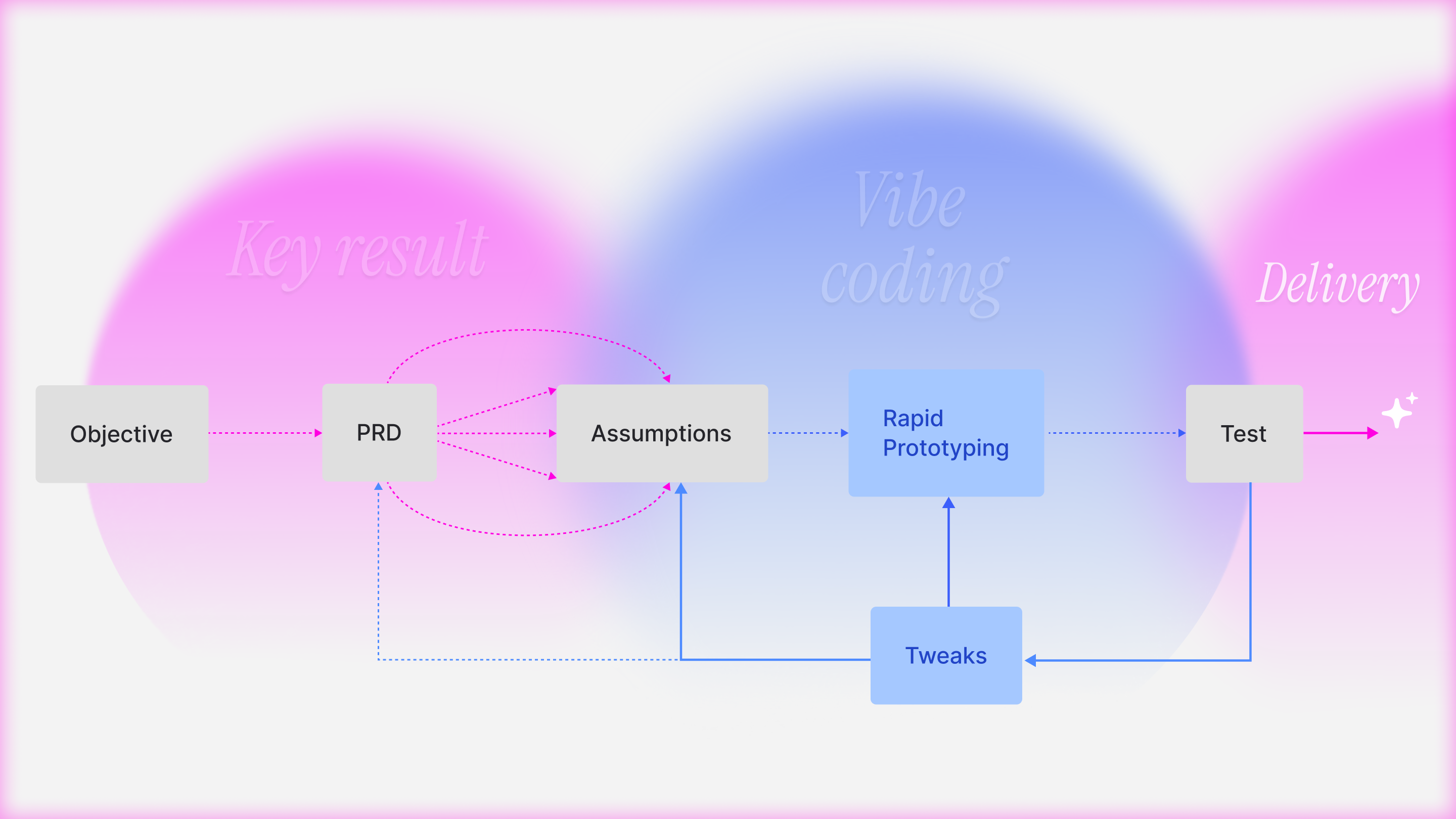
We connected the design work directly to the product roadmap:
Objective: Transform Diagram parsing from a consulting tool into a self-serve SaaS application that allows "High-Volume Contextualization".
Key Result:
- Efficiency: Reduce the "Time on Task" for reviewing a diagram.
- Quality: Achieve a user-verified precision/recall without heavy manual intervention
Improve Adoption
Firstly, to improve Adoption (HEART framework), I put forward the assumption that the user needed a better understanding of the new UI to minimise visual friction. My goal was to ensure users grasped the core concepts immediately so they would actually adopt the new workflow rather than ignoring it. The tool is complex, and users were skipping the visually dense, complex and static onboarding illustrations, leading to confusion. I worked on better communication of static images with UI-centric loops (GIFs) using Chameleon. By showing the actual interaction pattern (e.g., how to drag-and-drop a mapping), we reduced the "Time to First Value" for new users.
Continuous Discovery
As the onboarding illustration rolled out for early users, we observed a critical pattern where users still misunderstood. The friction wasn't just cognitive(understanding) but also very visual.
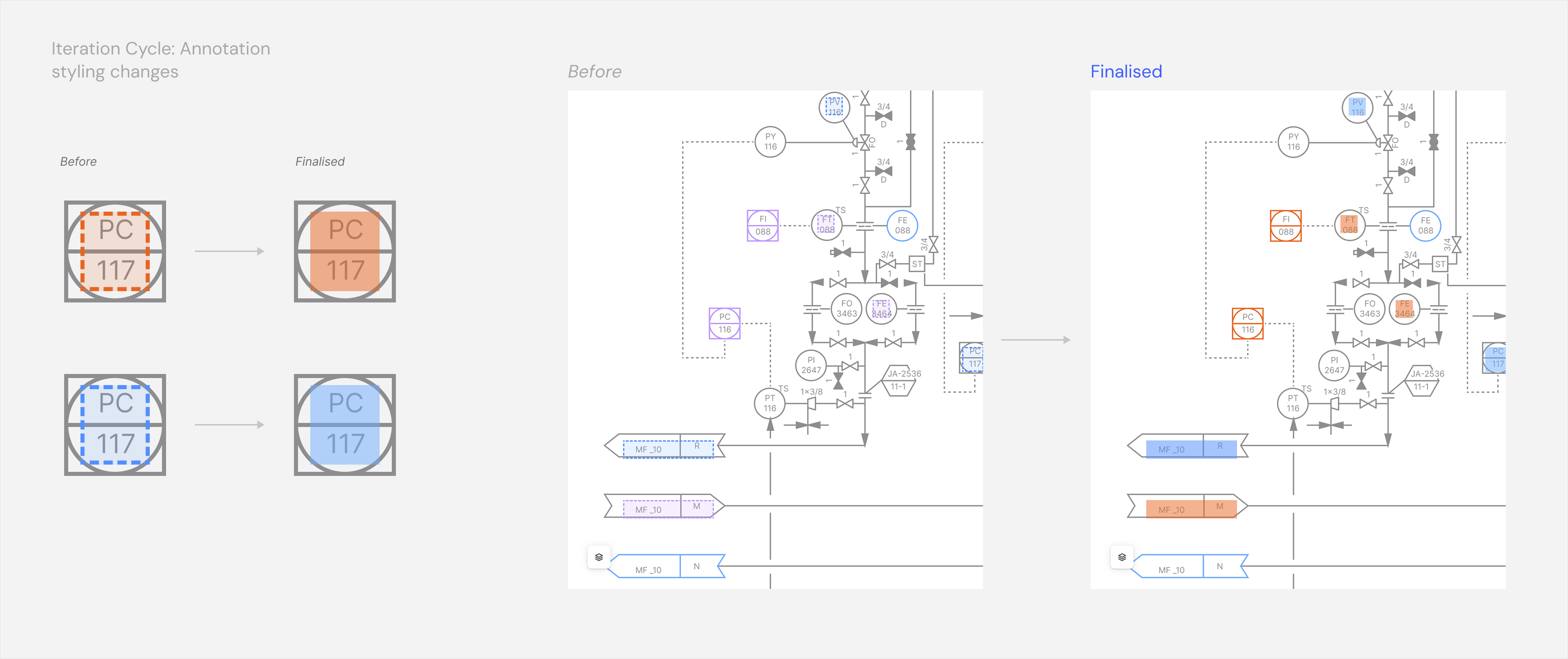
- Visual Noise: The Annotation Boxes were outlined as dotted lines, which added to the clutter of the complex P&ID lines, making it hard to read the engineering data underneath.
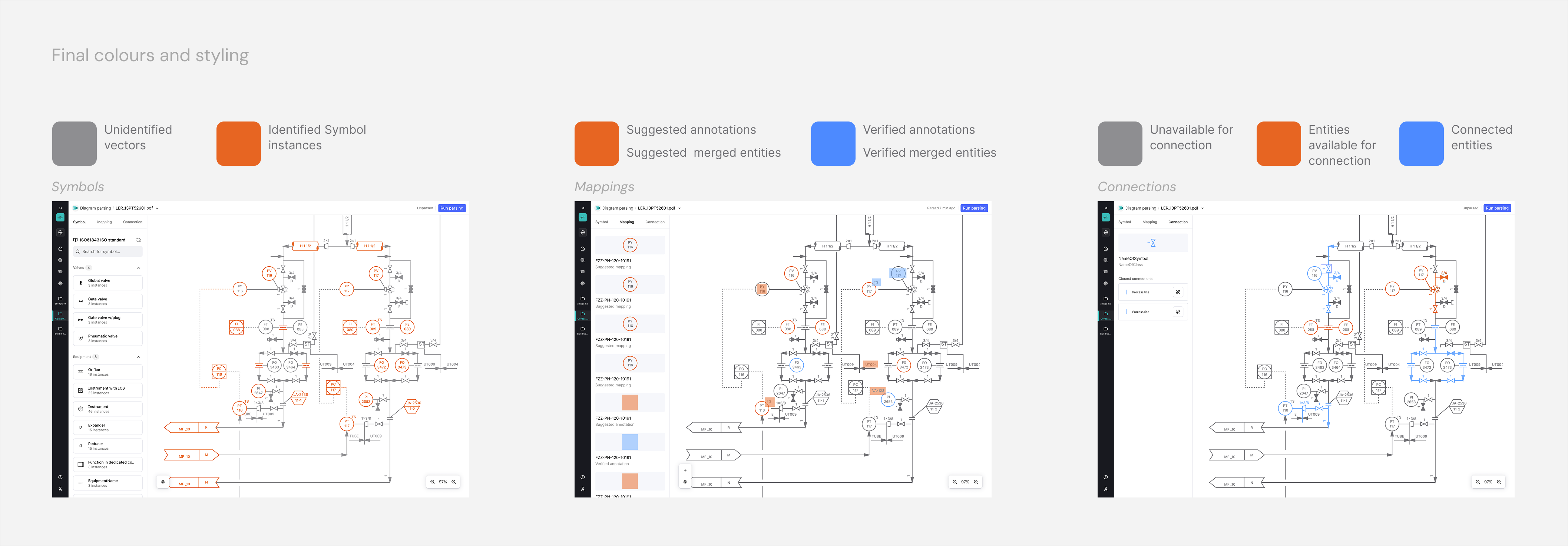
- Colour Logic: The original Blue/Purple coding failed accessibility tests and made verified vs suggested mappings hard to distinguish for users with some colour blindness.
For better Efficiency (Task Success), just better onboarding wasn't enough. We needed to fundamentally reduce the visual load of the UI itself.
Reducing Friction
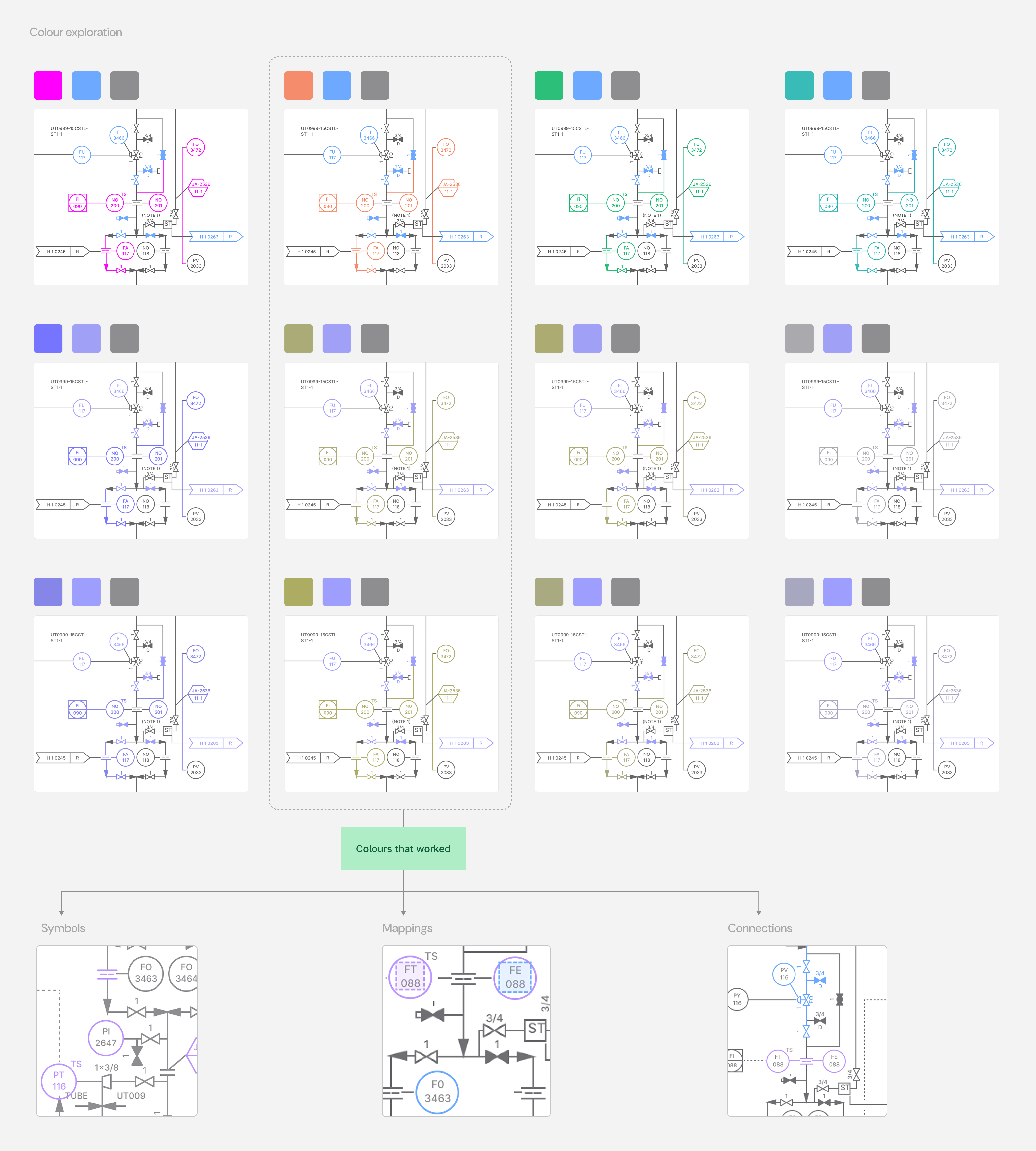
We tested pairings of colour against user confidence in clear distinction and accessibility.
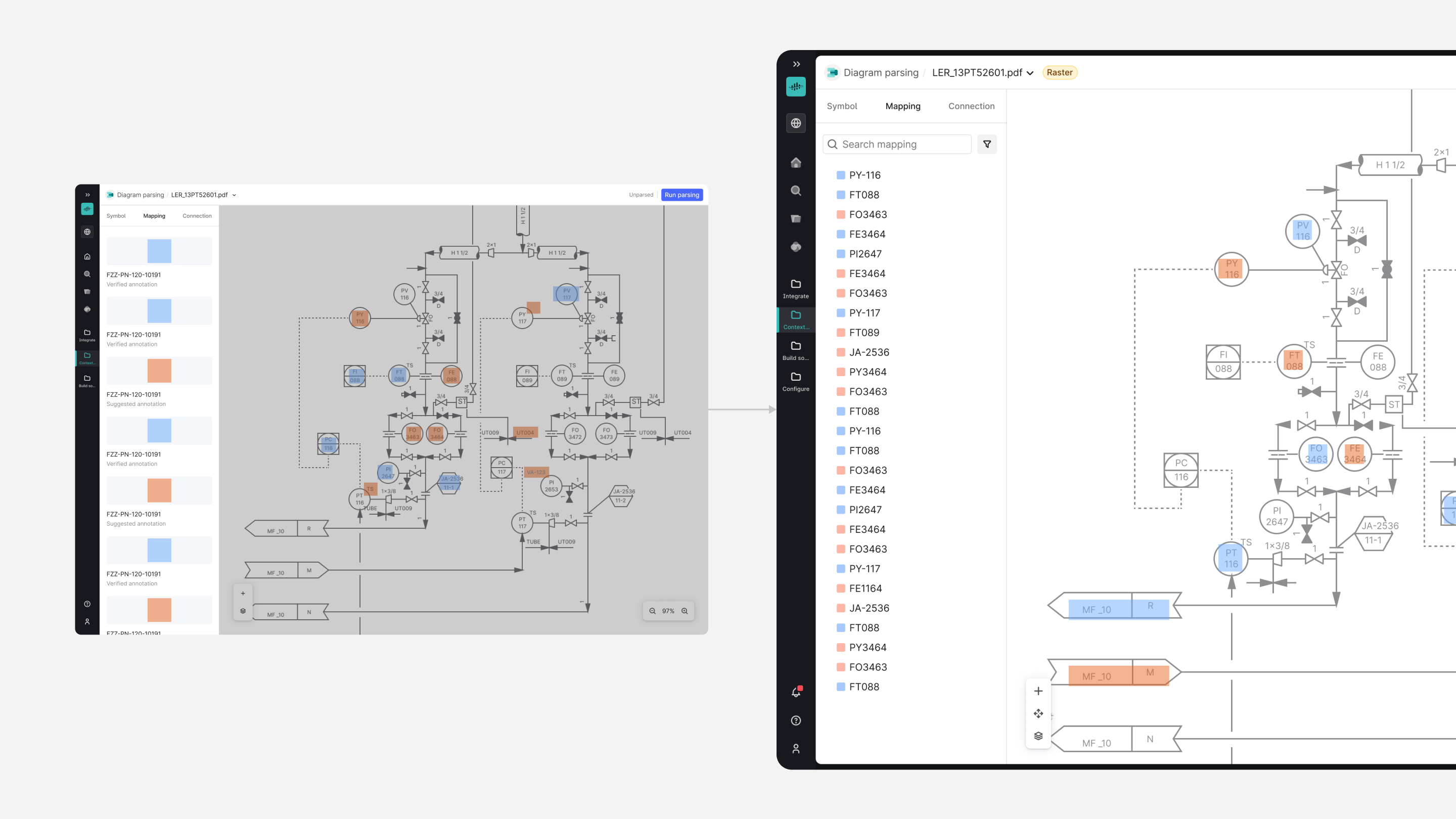
- We shifted to a Blue (Verified) and Orange (Suggested) logic to pass colour-blindness standards and create instant visual recognition.
- I also replaced the heavy dotted outlines with a semi-transparent fill with a subtle hover state for each annotation box that facilitated the user to notice better without visually overwhelming. The semi-transparent fill gave a sense of an ephemeral state for boxes, while also partly revealing the text detected underneath them.
This improved the efficiency as the user could scan the diagram faster, and the confidence metrics as the user could evaluate which detections demanded their attention.
User Feedback Loop
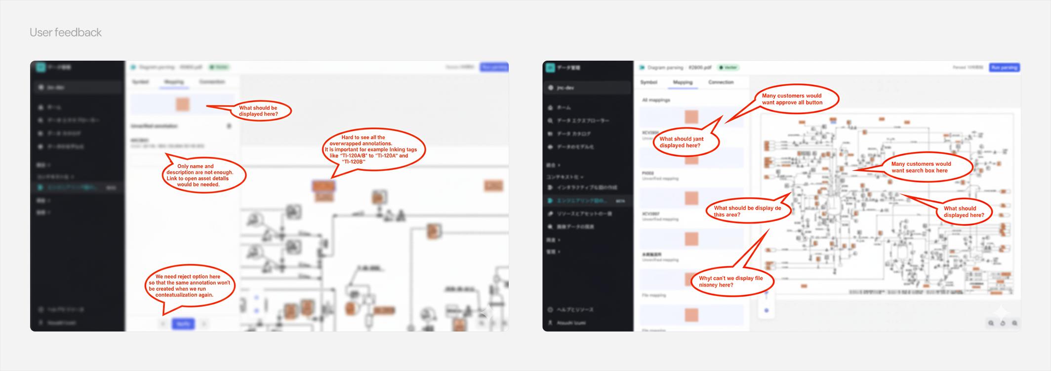
The previous low-effort UI changes were to test my assumptions about better user understanding of the new application interface. While users responded better to visual improvement, they also reported feedback (see image) that revealed some shortcomings in the mental model around the UX.
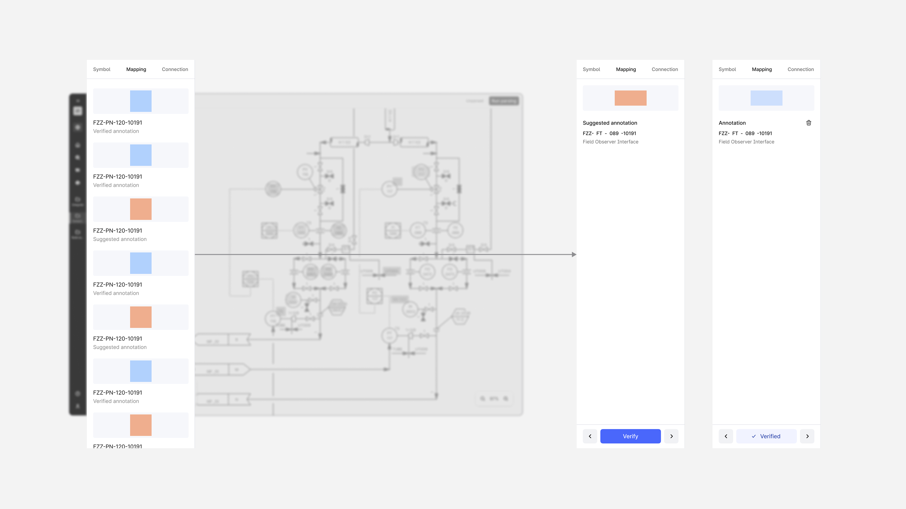
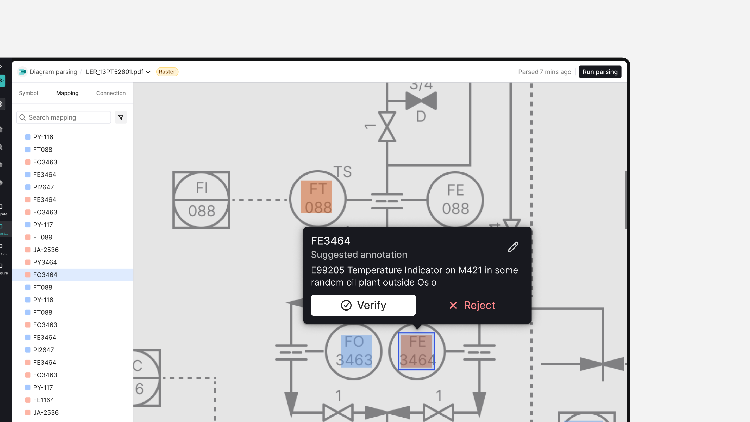
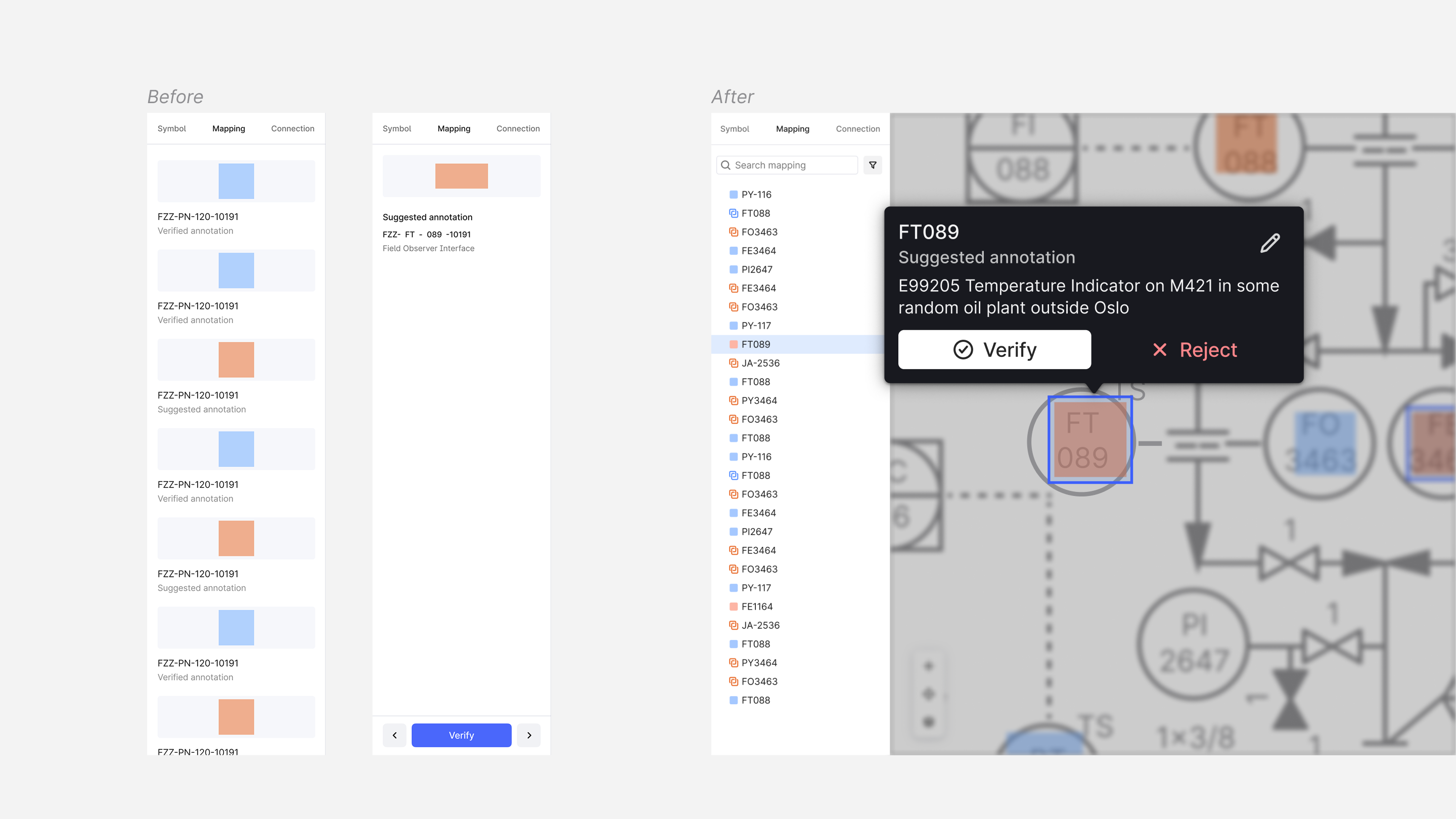
Missing Actions in the context: The side panel changed into a secondary side panel with detailed actions related to the selection. User didn't want to split their attention while looking at the diagram to the secondary side panel to take related actions like verify, reject and edit. They preferred doing it right where they were looking.
“Bloated” side panel: Users got confused by empty and spacious areas in the side panel, which were displaying granular metadata that was already visible on the canvas.
Static annotation position: They also signalled that even with the improved annotation UI, some overlapped ones in high-density areas were still cognitively overwhelming.
This critically affected the Efficiency KPI as users spent significantly more time travelling the mouse back and forth, along with the cognitive load.
Side panel experience
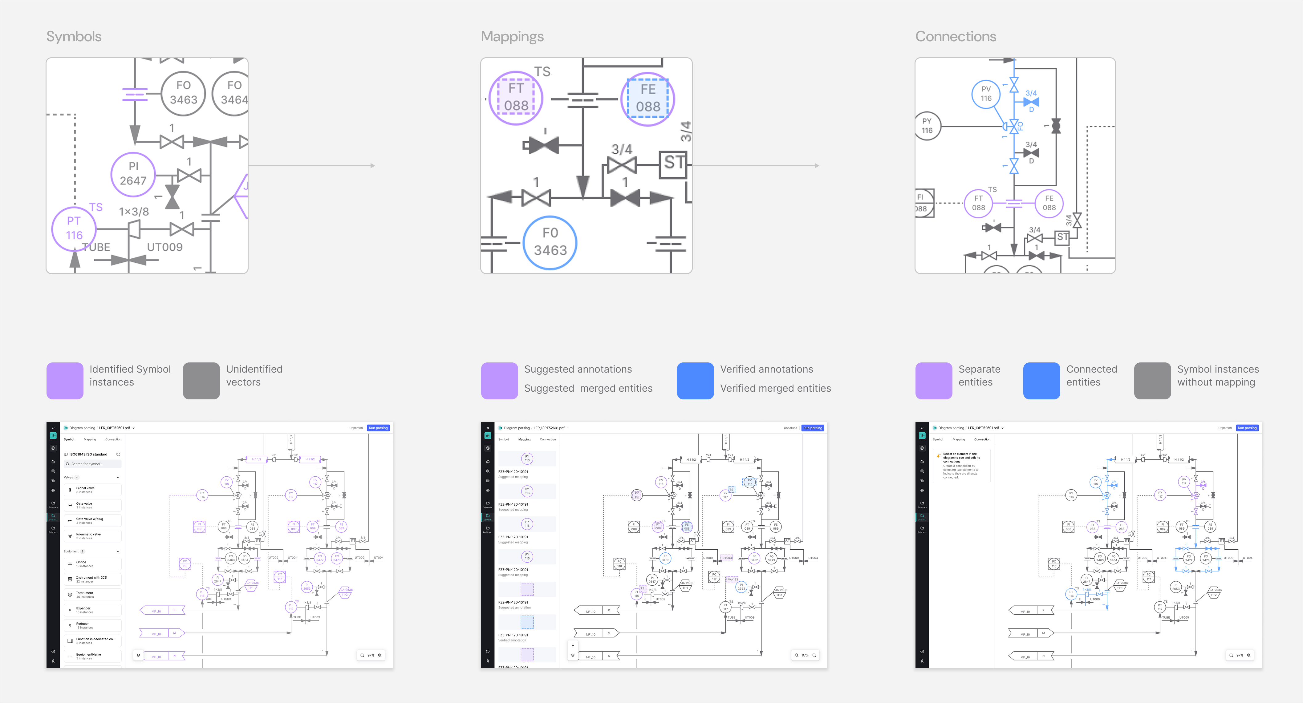
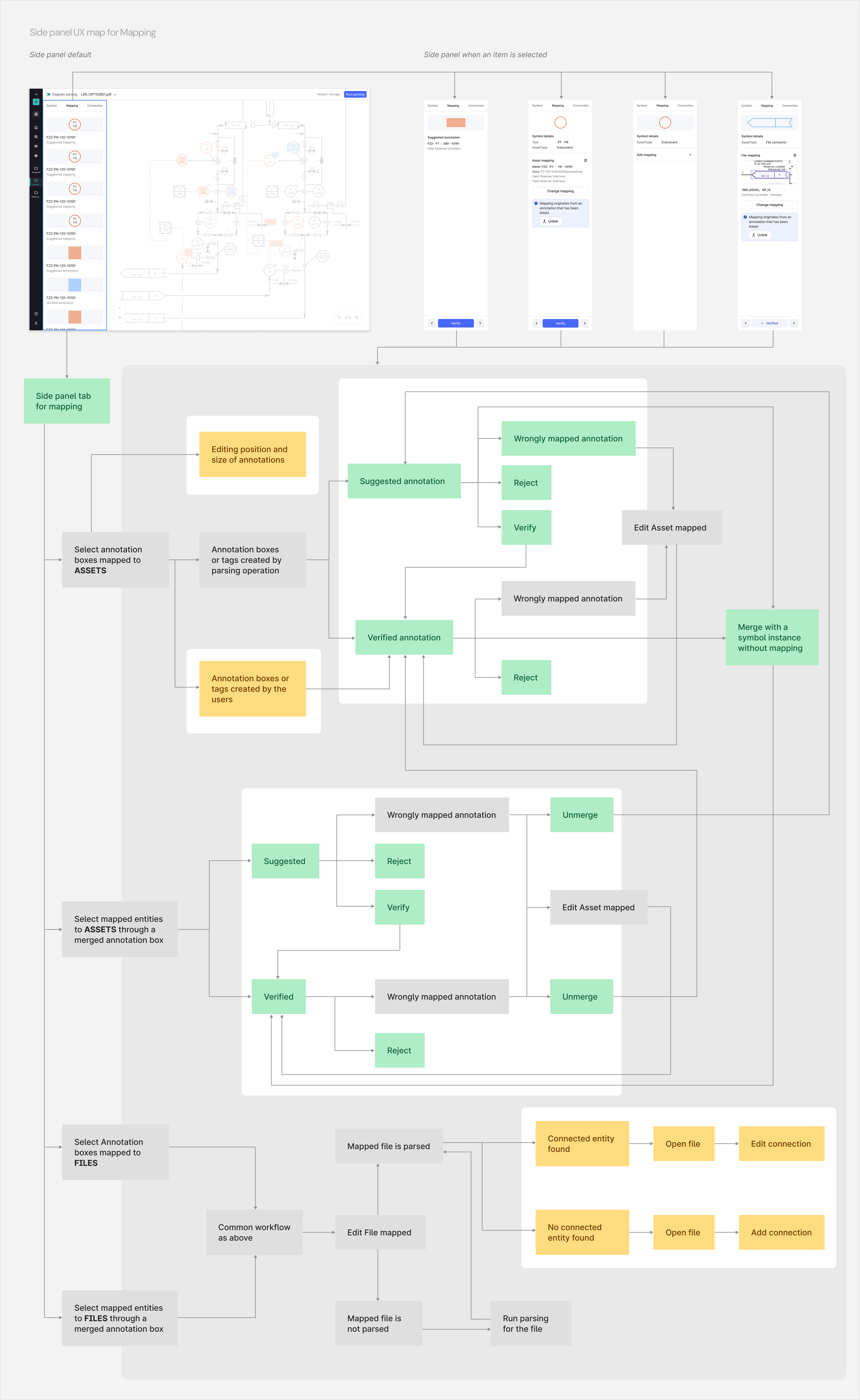
Within the application, each P&ID (Piping & Instrumentation Diagram) is surfaced in the side panel to the left of the canvas. The side panel contains three core tabs, each corresponding to a major behavioural mode of the tool:
- Symbols: Displays detected symbols extracted using the diagram parsing library; designers and engineers can inspect each symbol and review matches against the symbol library.
- Mapping: Shows verification status of symbol–asset links and annotation boxes bound via CDF (Cognite Data Fusion); users can approve, reject or edit mappings.
- Connections: Visualises relationships between mapped assets — for example, how pipes, flows, and connections are parsed and linked into a knowledge graph built in CDF.
Scalability
The side panel provided a good navigation for spatially arranged detections on the diagram, but was also treated in the application as the single source of truth for all actions. I put forward the assumption that users' cognitive load can be reduced by splitting the functionality of the side panel.
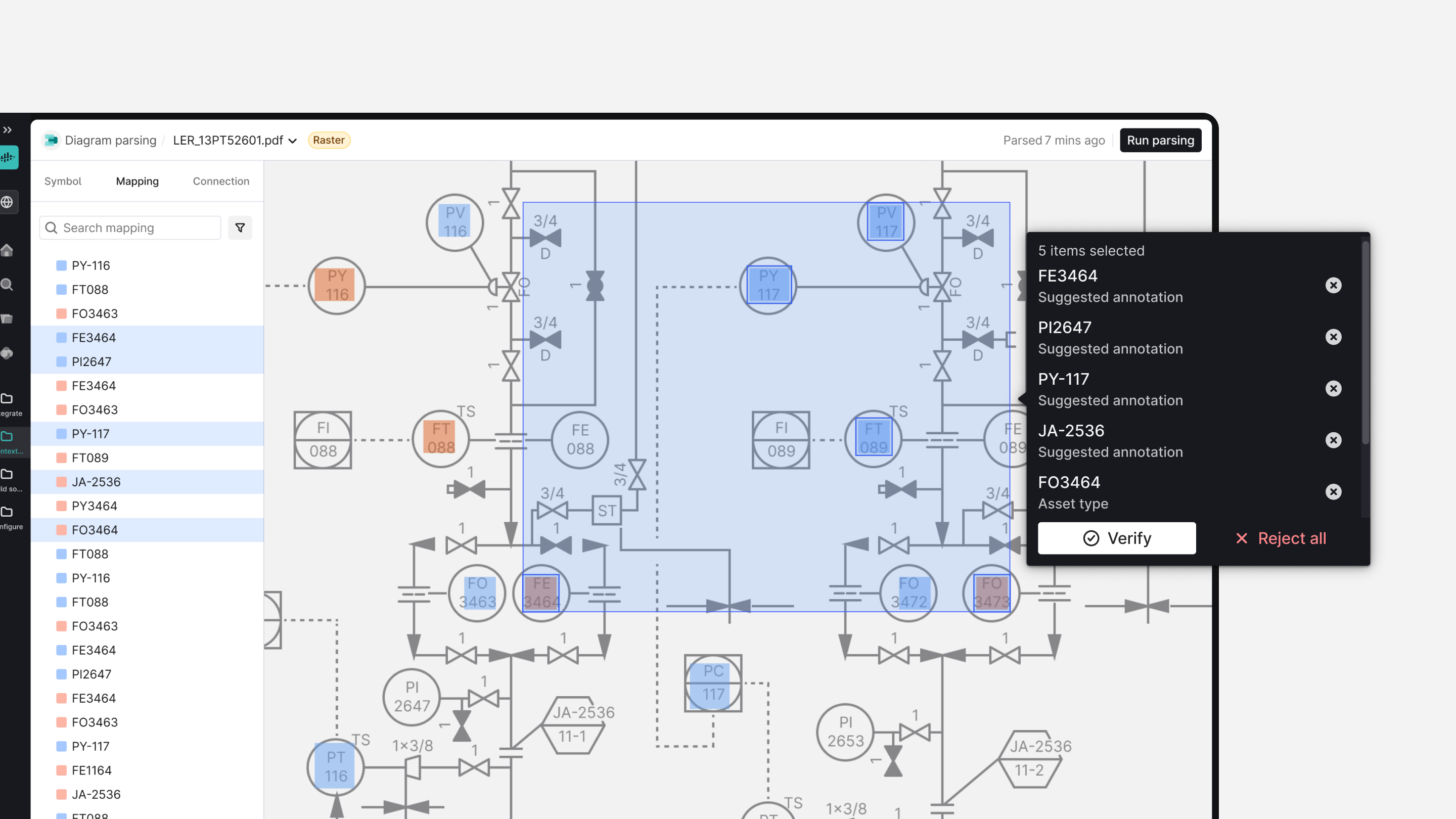
I started prototyping the Side Panel to a leaner version, which decouples all the detailed “micro” actions from the secondary side panel and moves them into a Popover that opens contextually next to the selected asset at the point of gaze on the diagram. The side panel was repurposed for high-level “macro” actions like Navigation and taking Bulk Selection. Popover also supported bulk actions at a “micro-level” as the user wanted, like verifying or rejecting many annotations ("Approve All button").
As the side panel allowed a large-scale overview, users spent less time on the task. The back-and-forth mouse travel became way faster as the popover allowed quick and easy focused, localised operations on high-density diagrams.
