Storytelling “Seb/सेब”: The beloved Himalayan harvest
Deliverables: Digital branding and User interface exercise
Project Type: Semester module project
Team: Siddharth Kothiyal
Scope: Branding, Packaging, User interface design
This project was individually done as part of a Branding exercise at National Institute of Fashion Technology, New Delhi where I studied communication design. I intended to make the brand as fun and friendly as the range of local products offered by the community.
Context
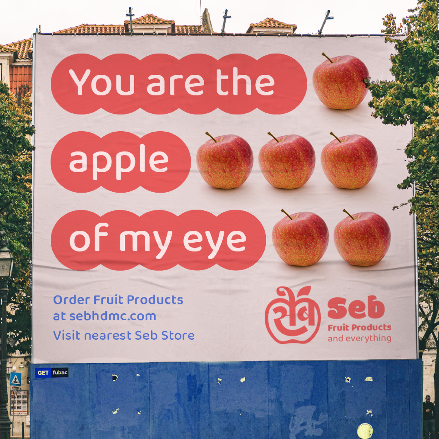
“Seb” means apple in Hindi and the term is commonly used by Indian Himalayan states of Himachal Pradesh, Uttarakhand and Kashmir growing high quality apples. The idea was to build an intricate and deeply human storytelling in a brand around the word. I was inpsired by the place and lives of people from these areas. Seb was imagined as the brand ambassador of the rich fruit harvest and the cultural identity of the region.
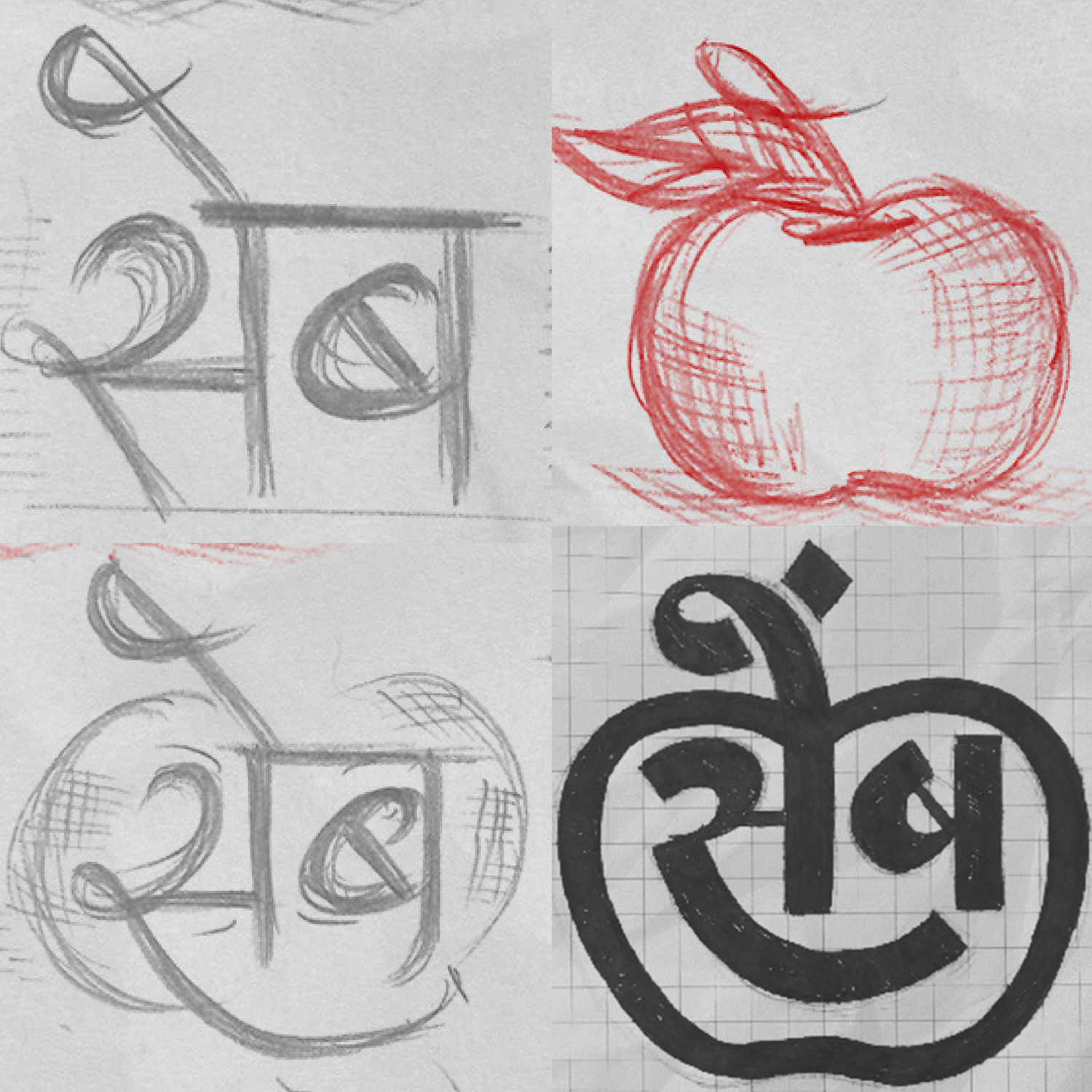
Ideation & Sketching
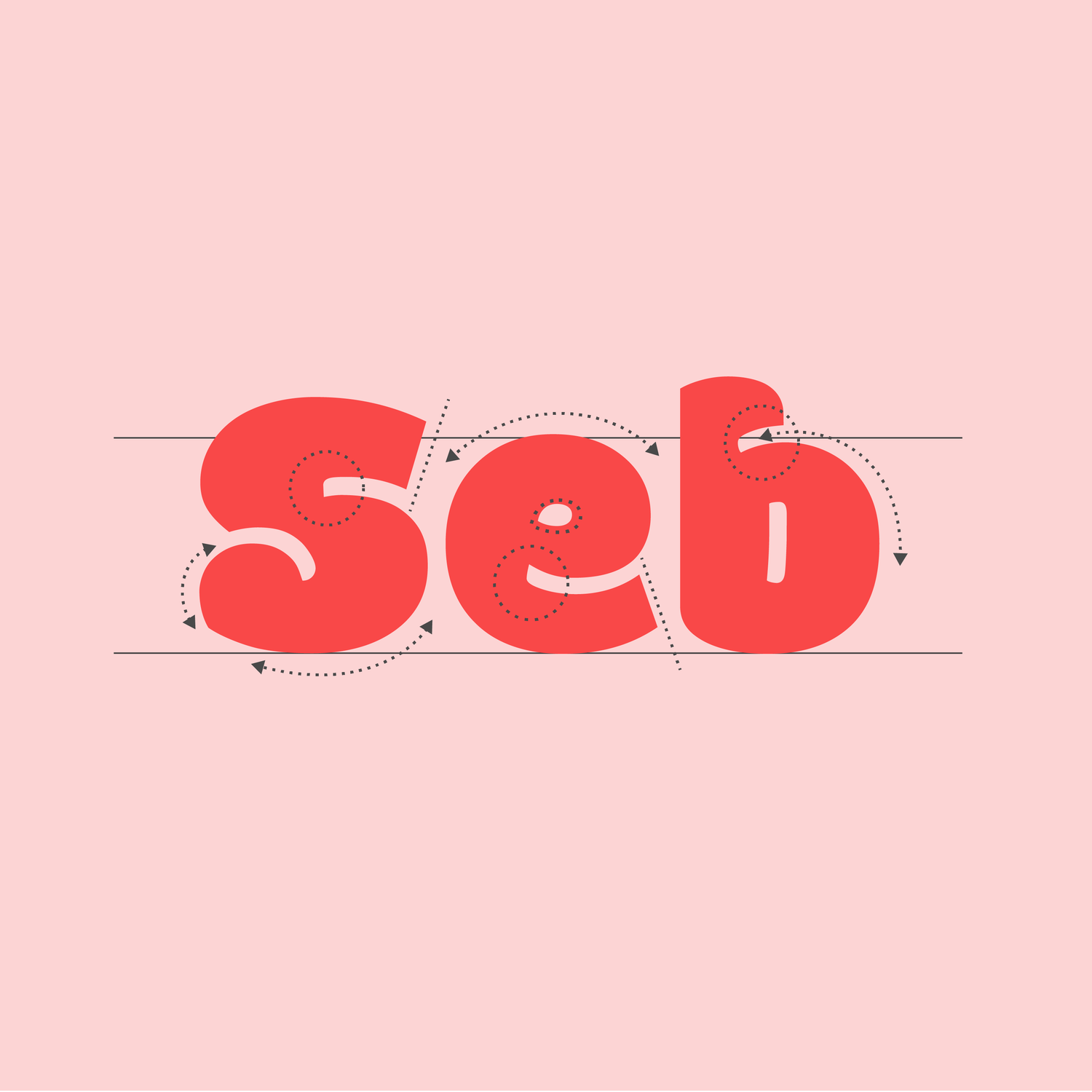
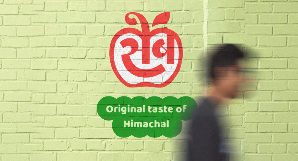
I wanted to play the visual trick of combining how Seb (सेब) is written in Devanagari script for Hindi with the shape of an apple. Stylising some aspects of the script in letters, I wanted to give an abstract hint towards a face. I used a heavy-chubby Indian display typeface called Modak for it’s cute and soft shapes with thin counter space details. It gave an overall look and feel of organic and fruity shapes.
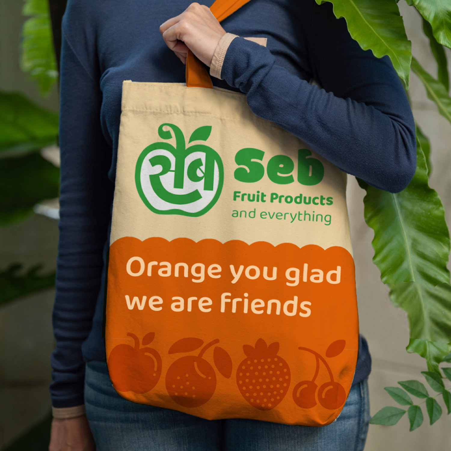
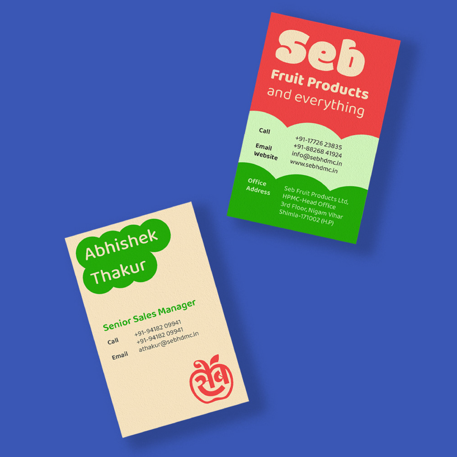
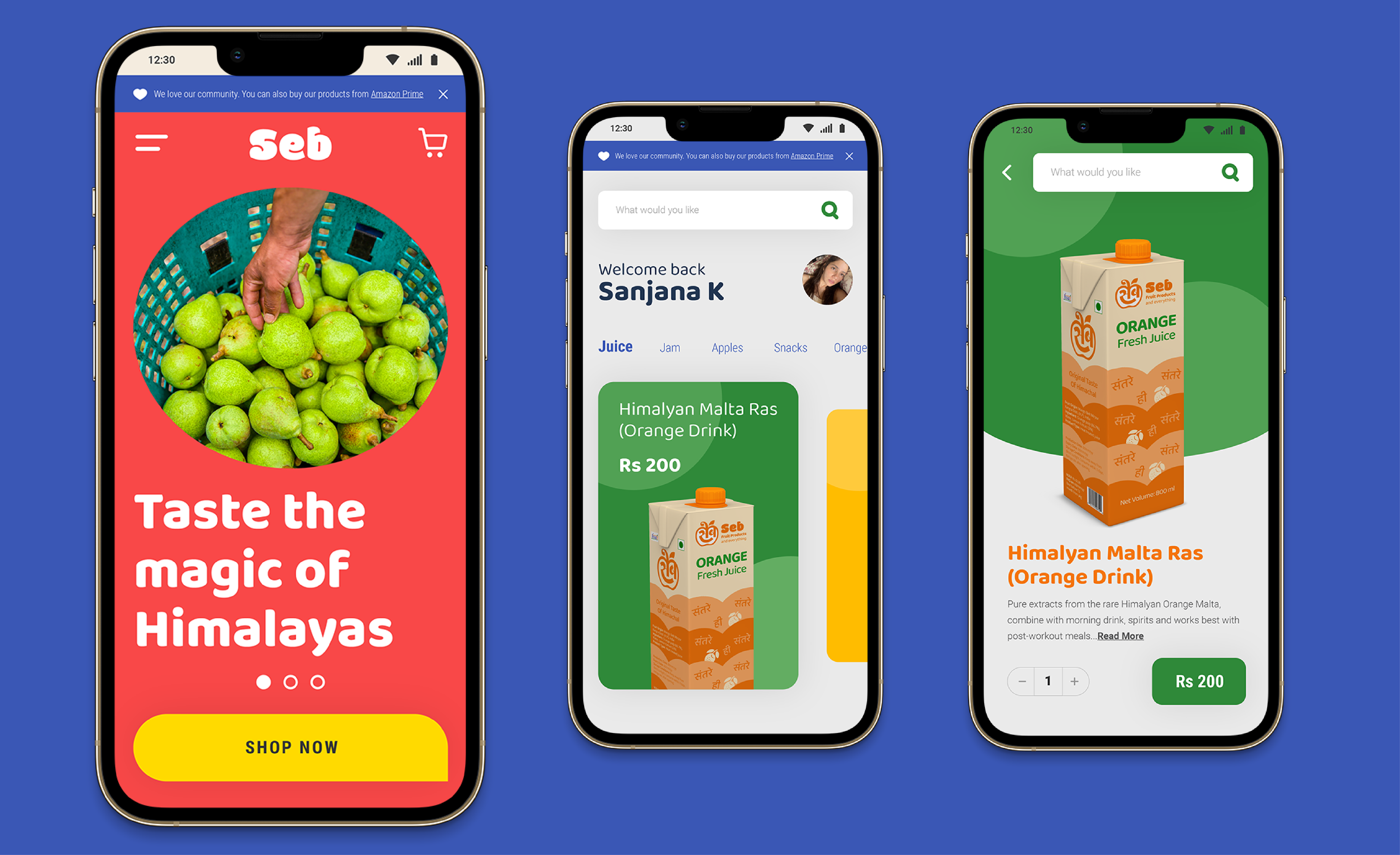
Final design & implementation
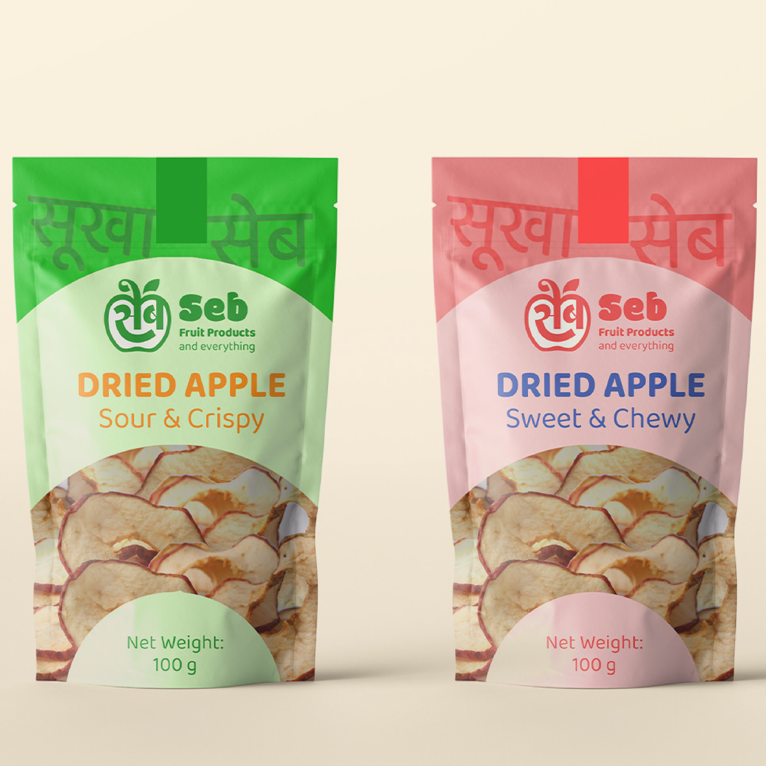
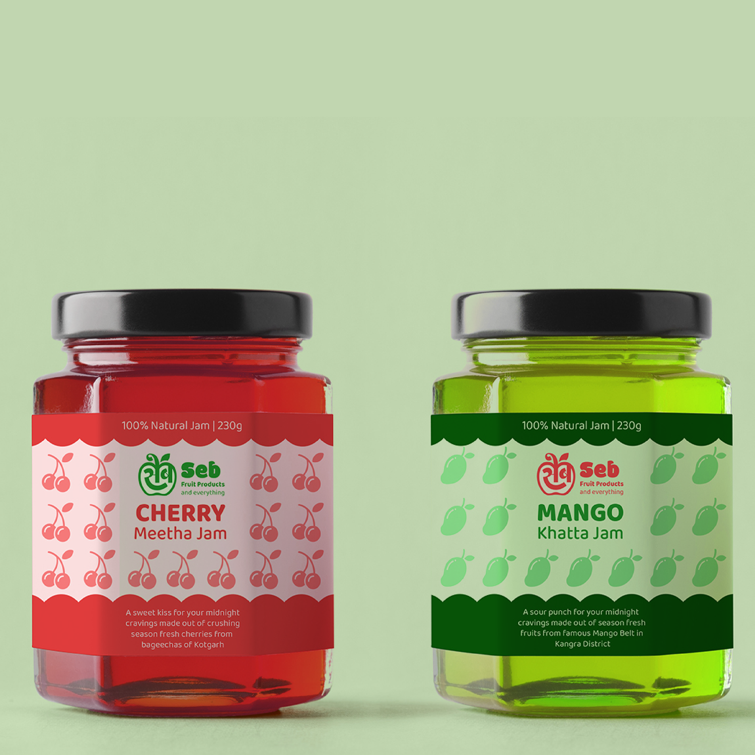
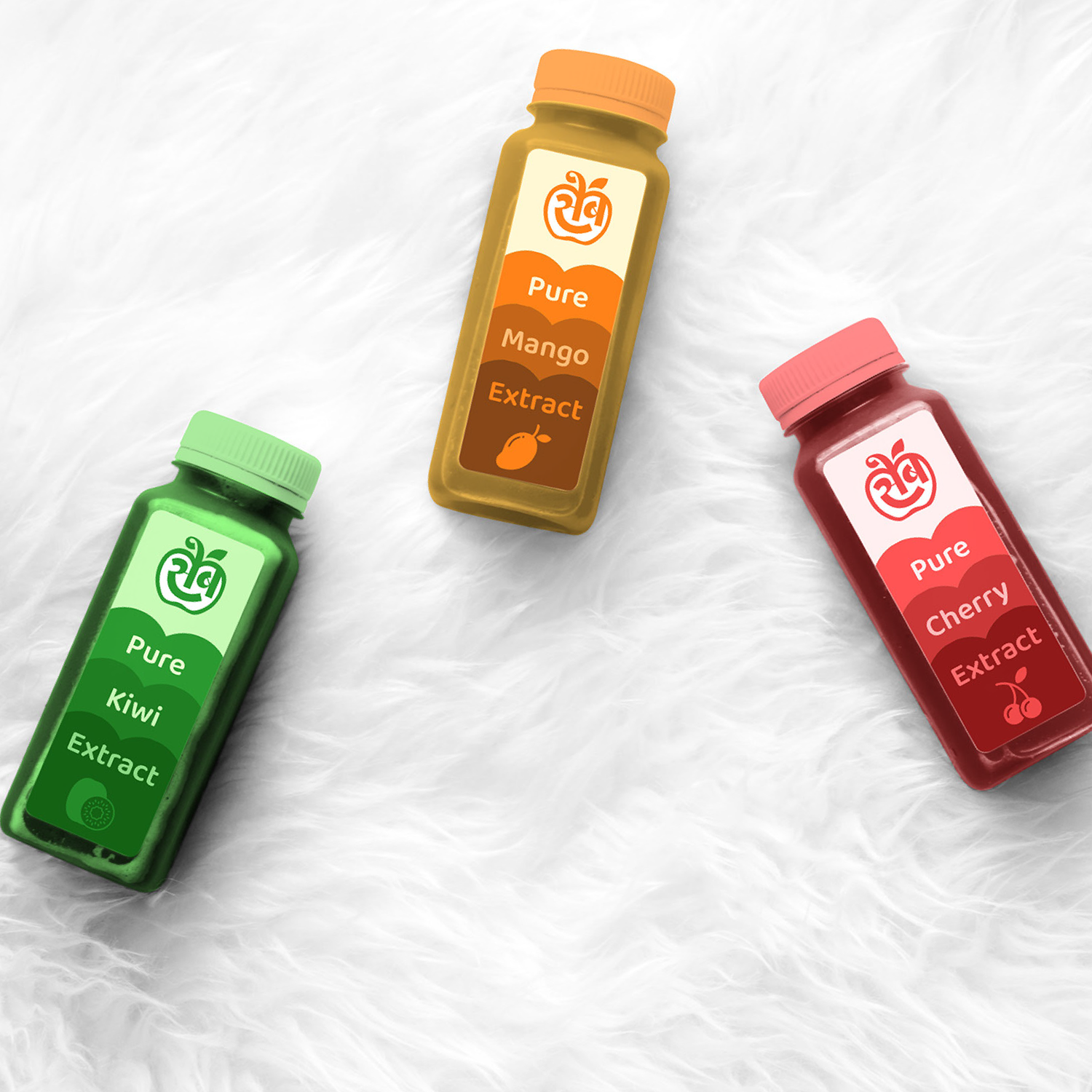
The visual language was created to complement the wholesome values of the brand. The tone of voice for the brand was playing with fruit puns. The packaging extends to locally-popular products such as Dry apply chips along with typographic textures of the Hindi word for it “ सूखा सेब ”. The language on packaging keeps switching between English, Hindi in Devanagari and Hindi in latin script. This form of communication is very common in Indian media